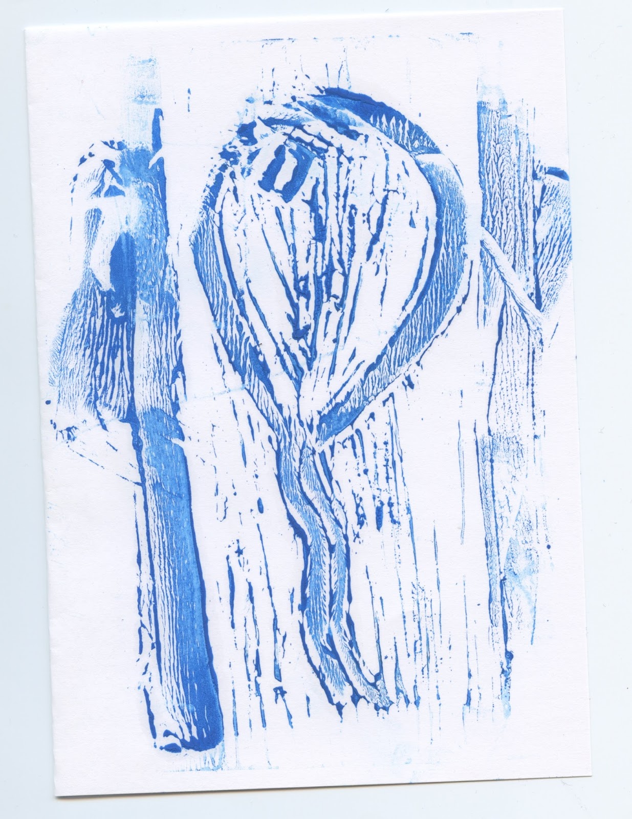
Sunday 12 March 2017

Linoprint

1st attempt


During my first experience of linoprint, I found the task very daughting with no previous workshops being held on the method, and thus I seeked advice from online tutorials, and friends who already gain great knowledge from the project. As when asking within the print room they appeared very busy. After buying the equipment I then went about cutting the lino. This inevitably ending up in myself being cut on three occasions, as I felt the lino was difficult to cut, and I am relatively clumsy. After around three hours of attempting to cut and print the lino, I gave up. With the above image expressing my passive anger with the process. The paint used was also not oil based and thus the effect of the print was very weak. 


2nd/3rd approach 


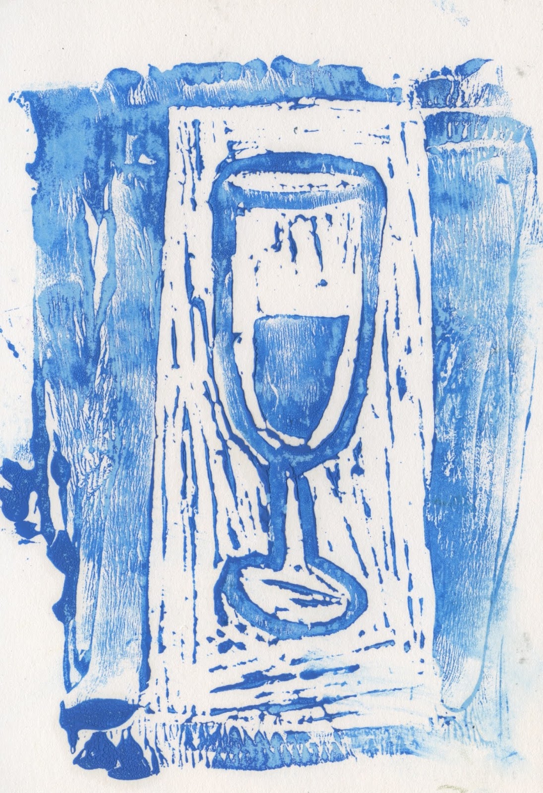
As my first experience of the process didn't go to plan I gain attempted to complete the lino at the assistance of a peer who showed me how to complete such task. Although my designs appeared very minimal and were not the strongest illustrations, I had completed the process with only one stab wound. This time an oil based paint was used in which stuck to the lino much more effectively. The main effect in which was gained within this process is that of the texture in which the lino expresses, as this would be engaging as most cards appear flat in nature. Although stating this, these cards would be difficult to mass produce. 

Friday 10 March 2017

Abstract-The art of design (Netflix original)

Abstract-The art of design is an 8 part documentary series in which focuses upon different parts of the art world, ranging from shoe design to illustration. Part 6 focuses upon that of Paula Scher, a pronoun graphic designer who has developed the visual language of many iconic brands and institutions globally. I decided to watch this documentary as during my talk with Tim from rabbit hole he referenced it, and the work in which Paula completes.

She talks largely about being part of pentagram a designers co-operative, whereby there are no bosses and everyone gets to have a 'shot' at what they really want to do, in a fun, friendly atmosphere. She also goes on to suggest how she bounces off other creatives. This is also very similar to what Tim said during our interview surrounding Duke studios being a creative network. This therefore positioning myself in a way to belive that in my future career I should work alongside numerous creatives from different disciplines, in order to develop strong, impactful work.

The documentary then goes onto state that she was and still is a large part of popular culture, by bringing design voice to a culture in which it was not previously seen. She altered the ways in which New York perceived style, with her work for 'the public' somewhat being mimicked throughout the city for the following five years. So much so that she completely altered the branding in order to allow it to be perceived completely different to that of its surroundings.

When discussing idea generation she suggested that her best ideas came when in a cab, as this allows the subconscious to take over, in turn developing forms of free associate. She then went on to suggest that if you're not in the skate of play you can't make anything. I felt that this largely related to myself as I often find that design takes over my life somehow and thus less innovative design is developed.

She then goes on to suggest that design exists beyond screens, it has an impact in real life, and thus needs to take human behaviour into account. A key example of this is that of the Palm Beach county voting slip, which is one of the worst pieces of graphic design ever created. The voting slip seemed illogical, and thus a large number of votes were given to the incorrect candidates, in turn messing up an entire system.

Overall the 50 minute documentary was highly engaging and expressed some really powerful visuals. Her relationship to type is also something in which I may investigate further within the future.


Thursday 2 March 2017

Oslo Design company


Oslo is a design based company in Leeds in which focuses largely upon the application of colour within design. The name of the company itself comes from its founders love of Oslo and scandinavian design, focusing largely on minimalism. Focusing upon local businesses there design work is present within the form of websites, print and apps. 

With a large focus being upon colour, it became evident within the talk how influential colour can be within design. As an Individual Ellie studied colour technology and science and thus has an extensive knowledge upon the ways in which humans interact with colour. As an individual she has participated in briefs whereby large scale companys such as Cadburys, have discussed the trademark purple with them, and how to effectively express design using this pantone. 

Colour libraries were also discussed, a relevant factor as I previously believed that pantone was the only one. The movement of colour between screen and print was also discussed with CMYK being a large consideration. 

Humans 3 colour vision  was also discussed with RGB being that of the main focus. this relating back to humans natural instincts such as seeing whether a berry is ripe or not. 

CMYK  was also described as a subtractive colour mixture due to the subjecting of wavelengths. 

In discussion with the set up of the business there were clear pros and cons. Firstly the cons suggested were that of the finical side of the business including VAT. Whereas the pros are selecting the work in which you complete, and being able to run to your own timetable. 


Companies in which Oslo have previously worked with