Monday 29 February 2016

modernism ideas


I experimented with negatives as I felt that they may be able to add an extra dimension towards the design, and thus would work more effectively upon a stamp format. The conjoined lines appear somewhat sharp and dangerous, factors in which I would not want to associated myself with. I also feel that the dark designs do not express my personality, as they appear far too serious. 


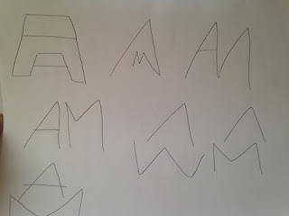
In order to produce further designs in which appeared less rigid, I decided to follow a basic line structure. By doing this the designs began to appear to follow modernism much more closely. I experimented by involving two A's as well as singular, in order to correlate which worked most effectively.      


From this I then attempted to incorporate the rest of my initials. I focused specifically on the A and M and how they can be positioned in order to balance out one another. Again I felt that some designs appeared sharp and uninviting, thus these were discontinued.  


Taking influence from the previous designs I then began to experiment with more open approaches, using negative space to balance the harsh nature of the design. I felt that some designs appeared much more graphical than others and thus I decided to take the most influential components further, this including thin line stokes, negative space and sleek type. 
From doing this I then developed some pieces in which I felt drew the true atmosphere from my previous designs. In a similar format they involve both letters coherently, following the basis of a path. The basic structure is minimal, as the thin strokes are balanced by vast amounts of negative space. The black and white colour scheme also follows that of a modernist approach.

Sunday 28 February 2016

C.A.D Logos 1st


This idea expresses the combining of two A's in order to promote the idea of 'Alice approved'. Although two A's are obviously present I feel that the whole design lacks a professional outlook due to the thickness of the lines resembling imagery that is present within children's books.


In order to again express two A's I developed the basic anatomy involving an extra bar.  Although then creating two letterforms I felt the design disturbed the basic concept behind type and thus made the consumer feel somewhat uncomfortable. 


I explored with a variety of approaches in which focus upon structure and composition. The designs follow a black and white format in order to link closely to the Swiss design in which they derive. The 3rd and 6th design appeal most to me, although the warped nature of the 6th must be altered in order to be considered, as it appears very awkward in design.


During this process I attempted to develop lavish type in which appeared highly exaggerated. I wanted the type to appear fluid in order to express the flowing nature in which is the creative process. I experimented with both hand rendered type and already developed typefaces, both in which contain flaws. The hand rendered designs may be personal to me but it would take a long period to construct a full alphabet in which I may use to promote different aspects of my design. And as I do not own the other typeface other individuals may use it to promote their design practice and thus it is not individual to me. Stating this many design individuals use helvetica to express their own type in which is not unique.


Saturday 27 February 2016

Second drawings


Following the modernist approach I focused largely on composition and how the lines could coincide with one another effectively. I felt that by doing this it would resemble multiple personality traits in which I maintain such as organisation skills. Personally I felt that the middle column possessed the most effective designs as their aesthetic is most attention grabbing.I also believe that these designs could be pushed much further in order to represent a style in which resembles my work. During the following design stages I will experiment with these ideas focusing upon clarity and composition. 


Again I experimented with script looking at both my full name and initials. I explored ways in which the letterforms could coincide effectively with one another, highlighting key structural features of each individual letterform. Designs I felt most effective where that in which elongated the tails and bars. By doing this the typeface seemed to break the boundaries of normal type design, in turn denoting myself as a designer in which likes to remove boundaries and advance further within the design process. This being a factor in which John has previously mentioned when producing work for clients.


In an attempt to make my design appear more stamp like I decided to place them within a circle. Not only does this make the designs appear in a stamp format but it also conveys friendly behaviour and unity, factors in which I would hope clients felt when working with me within the future. The designs in which I feel most effective from this are the ones in which contain the signature styled handwriting, this may also create further connotations to the 'stamp of approval' idea, as it may suggest my signature agreeing the the terms in which the company express. 

Friday 26 February 2016

Initial drawings and crit


Initials were highly influential within my research and thus I began to develop some ideas surrounding ways in which they may be represented. Hand rendered approaches were experimented with allowing for multiple design solutions. Some of the strongest concepts being that of a modernist approach and a signature style. I felt that by containing the design within a circle also allowed for a friendly approach in which also signifies unity, a factor I would definitely like to express further. 

When asking my peers about what design aspects I should take further they suggested that the modernist approach would appear far more grounded if I were to focus upon composition rather than the typeface itself. The signature style approaches were also highly commemorated, although it was suggest that an initial approach would appear much more sophisticated. 

Thursday 25 February 2016

Stamp of approval


Thinking specifically about who I am as a designer and my ethics, I began to think of my logo as a sort of stamp, a stamp of approval. So many designers end up throwing their name towards meaningless design, which sometimes may even be damaging to the environment or even people. As an individual I will not be labeling myself to any brand in which does such things, as I will not be a contributing factor to it's growth.


The minimal nature of this design is what makes it so successful. The single initial used creates an enigma, one in which is resolved on the reverse of the business card. The typography has been altered to suggest the designer's personality traits. The pure usage of typography would suggest that the designer is specialised within this area, I may consider a similar approach when developing my own designs in order to express what forms of design I am interested in. 


Initials can be projected in multiple ways in order to device different personality traits. Curved edges appear friendly whereas harsh straight lines exhibit power and professionalism.  I must be aware of this when developing my own designs. 


The modernist approach to this logo is highly effective as it not only portrays the designer themselves but also the style of art in which they are interested. I personally favour modernist designs and would really like to push this further within future projects, so this may be an area in which to explore.


Manipulation of type can effectively convey multiple messages. For example the first design would resemble that of A & A working collectively together, in a tight nit studio, whereas the second image would convey speed and durability. 


Script type conveys personality in a creative manner. It is also somewhat personal and thus exhibits a friendly atmosphere. Developing my own script type or even personalising one may be an effective way in which to create personal touches towards my logo.   

Hannah drawings


Following the research closely, I developed some initial drawings for Hannah's logo focusing upon aesthetic and context. A variation of approaches were explored including geometric patterns, embossing and the involvement of glitter. When discussing the designs with Hannah, she stated that her favourite were that of the glitter initials, the water colour and the ones involving flowers. She also suggested that the colour palette used should express her as a designer. 

Taking note of what Hannah would like the design to appear like aesthetically, I decided to experiment further using C.A.D.

Hannah's branding research

In order to begin the process of designing an identity of Hannah I began to research logos/business cards of a similar format to what Hannah would like to be produced. I variant of approaches were viewed in order to gather a wide range of ideas.


I decided to look at business cards in which specifically promote glitter, a factor in which Hannah was keen to involve within the design. I feel that the above design somewhat overkills the sentiment of using glitter, as the design appears somewhat tacky and unnecessary. If I were to use glitter within the design, it would be used minimally so the approach didn't mimic that of above.  


This foil embossed piece is minimal yet extremely effective. The design explores a feminine approach without using stereotypical gender attributes. The usage of gold refers to high quality work, as well as making the design itself appear expensive.  Foil embossing is also a factor in which the consumers (graphic designers) would appreciate and easily recognise. 


The minimal usage of initials introduces the the designer without overpowering the consumer initially with information. Similar to a book the front should appear impactive and introduce the content, but rather the blurb should display an overview of what is expressed inside. This also applying to that of a business card. 


As Hannah's work often expresses geometric patterns, I felt that it would be important to involve a design in which explores this sentiment. Again gold has been used in order to explore dominance within design practice.  The design has also been debossed, thus making the design not only appear pleasing but also feel that way aswell. 


The combination of Initials in this piece has been expressed through a flowing serif typeface, in which again expresses femininity. The movement within the typeface also expresses an ease, something which in turn embeds the sentiment of the design being for that of a creative individual.  The usage of glitter is minimal, a factor in which I would like to express through my design. I specifically enjoy how only key aspects of the design are expressed through glitter, and thus not overpowering the consumer.


Thinking about Hannah's personal aesthetic one of her tattoo's involves a component of flowers, and thus I researched some designs in which follow a flower based format. Although minimal and straightforward I feel that this design does not express the flowing nature of design in which I feel expresses Hannah as a designer. If I were to develop a similar piece I would likely involve a different shape, that feels less rigid and formal.


The above design explores multiple factors in which I wanted this project to include, geometric patterns, visible relevance to art and also a flowing typeface. The watercolour backdrop expresses creativity, as well as design methods other than C.A.D, a factor in which designers would thrive upon as it is uncommon within branding. This will be a factor in which I explore during the following design stages.

Hannah's

When discussing with Hannah how she would like her self branding to be produced she stated that she would like it to mimic her personal style, and how she presents herself as an individual.  A fun, feminine approach in which contains multiple colours/textures, with attributes such as glitter being suggested.  As Hannah also has multiple tattoo's I feel as if this may also be a route in which may be explored.

Village Life


As a family we are highly involved within our village community participating in pantomimes, ceilidh's, church events and even the village bonfire. Although the main bonfire stopped 5 years ago (due to the event becoming far larger in scale than originally tended), there are still small bonfires held for that of village members only. There are some really talented artists living where I live and I feel that this is highly expressed through our villages events. Although I was unable to participate in any creative aspect of this year's build, having previously developed wicker lanterns for the light parade, I was still able to see part of the build, and witness the bonfire itself. As a designer I would definitely like to be involved within my community more during future events, keeping the village atmosphere alive.


Previous bonfires:


Jades save the date


As one of my bridesmaid duties for my cousin's wedding she asked me to produce some photography in which she could then use to develop her 'Save the dates'. I felt that by doing this I was able to experience a client approach in which our opinions varied. When selecting the imagery from the contact sheet, some images in which I felt were strong were left out, but as it was the 'client's' choice I was unable to make comment.  I felt that doing this gave me an insight into my future graphic design career, whereas others do not appreciate some areas of your work.

Letterpress


As the letterpress induction over ran there was no time for me to actually develop my own pieces, and thus in my following project I decided to develop some pieces during my own time. I felt it was important that I gathered a hands on experience of letterpress in order to fully remember the process.  Similar to other traditional print methods the processes itself can be repeated in order to produce multiple copies, with only the construction of the plate and cleaning up taking time,,Due to this I feel that I would only use letterpress when having a couple of hours free so I can develop multiple approaches. 

As it was my first attempt using letterpress I did encounter some holds backs, including missing a letter out of the plate which I did not realise until after the deconstruction of the plate. I also uncovered how much ink is appropriate and the results of under/over inking. 

Overall, I would definitely use the process again as I found the outcomes to be much more successful than that of C.A.D produced type.