Following the concept of a glitter based design, I began to explore ways in which glitter and type could coincide to develop a design in which feels much more sophisticated to that of the previous designs.
A broad tonal palette was explored, in order for the type to appear functional yet glamorous, a component in which Hannah specified during the initial feedback session.
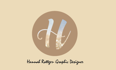
An off brown was chosen in order to highlight the colours captured within the type, creating a greater emphasis upon the initial. I decided upon an initialed approach due to its minimal nature appearing somewhat as an enigma, in which the consumer would have to discover.
I experimented with business cards in order to show Hannah the potential of said logo. When asking Hannah about her feelings towards the design she stated that she felt the brown tones lacked her colourful personality, and that the design's aesthetic should involve some form of artwork, for example watercolours. When faced with this I felt that I must develop an entirely different approach in order to tick her design criteria, a factor in which is often forgotten within my own personal design. During the following stage, I will look closely at color and type, in order to express the 'free-flowing' design in which Hannah would like to associate herself with.


No comments:
Post a Comment