Sunday, 13 May 2018
end of module evaluation
Through the OUGD602 module, a range of attributes has contributed to my professional engagement. By completing a work placement, an in-depth knowledge of the industry has been achieved, gaining an insight into a professional environment. Informing views on my future career, my time at Spiral highlighted that I am not suitable for an artwork role, and that a variety of other creative career paths may be an option to me. These have been highlighted within my personal branding.
In terms of engagement, a collection of events, talks, workshops and studio visits have prompted a knowledge of the design industry, offering a realistic insight into the sensibility of gaining creative work after university. In order to combat the lack of creative junior roles available, especially for women, careers events have been attended, as well as applications for work being made via the internet, and the sending of my creative pack. This allowing myself to stand out against the thousands of other graphic design graduates based in the UK.
In terms of self-branding, a range of deliverables have been devised, showcasing myself both digitally and physically. This promoting mass exposure. Innovative ways in which to create creative partnerships have also been explored, although in general terms, face to face conversations have been most effective.
When outlining relationships with collaborators, it may be suggested that many influencing factors have been discovered this year, including the issues in which may arise when working collaboratively with friends. These challenges were overcome, prompting a professional attitude at all times. This attitude has also been established when working alongside live clients, ensuring that their demands are met. Strong relationships have been built through this process, offering future client based work.
In order to further promote myself within the future, it has been decided that after university a range of relevant personal projects will be completed. This extending my portfolio and showcasing passions. In terms of a professional creative role, studios will be contacted over the forthcoming months, with freelance projects supporting my creative output in the meantime.
End of course evaluation
Over the past three years, a range of skills has been developed, promoting myself as a professional.
Skills developed:
Skills developed:
- Screenprint
- monoprint
- Adobe Creative Suite skills
- Presentation skills
- Confidence
- Professional engagement
- creative understanding
- environmental understanding
- Conceptual skills
- skills relating to aesthetics
- knowledge of design theorists
- knowledge of the design industry
- communication skills
As well as these skills, a range of other attributes has been gained, including strong creative links. Using these skills, I will attempt to gain a creative job after university, which will aid my future career path.
Time management

In terms of time management skills, this year has provided me with an insight as to how to formulate my time effectively, often prioritising essential work. A range of management skills have been implemented, these have been listed below:
- Wall calendar- allowing for an overarching time plan, ensuring client briefs etc are met.
- Diary- allowing for individual tasks to be set each day
- Online calendar-allowing for real-time notifications, ensuring events, talks and classes are attended.
- Stickey notes have also been used on a daily basis, to help me to prioritise tasks.
Privacy of social platforms
This blog outlines my pre-existing social medias, and efforts in which I have completed to ensure privacy. This promoting myself as a professional.

- Any unprofessional material has been hidden from my facebook (this includes nights out etc).
- The privacy settings is also strict, ensuring that only information I share may be accessed.


In order to showcase my personality, key talks in which I have found inspiring have been made un-private, this also includes creative engagement such as events and the sharing of other professionals work.
Digital Porfolio
A digital portfolio was completed, which establishes my brand identity. In accordance to Darren Scotland, the strongest pieces have been presented at the beginning and middle of the portfolio. A digital portfolio will be derivedthe portfolio surgery (in uni) on the 18th of May
A digital portfolio was completed, which establishes my brand identity. In accordance to Darren Scotland, the strongest pieces have been presented at the beginning and middle of the portfolio. A digital portfolio will be derived at the portfolio surgery (in uni) on the 18th of May
Photographer, Sam Dennis, took proffesional images of my work, allowing for engaging outcomes to be implemented within my portfolio
https://www.linkedin.com/in/alice-morris-044577106/

A Linkedin has been set up in compliance to my personal branding. Offering a platform to engage with other creatives, connections can be easily made.
How I have used LinkedIn effectively:

A Linkedin has been set up in compliance to my personal branding. Offering a platform to engage with other creatives, connections can be easily made.
How I have used LinkedIn effectively:
- engaged with professionals, and connected with those who I would like to work for
- expanding my creative network
- allowed for me to look professional when contacting studios
Behance
The following blog post offers an opinion on social platforms, discussing which will be most effective at displaying my work.
__________________________________________________________________

Some creatives use behance instead of a full website...Eve Warren is a key example of this..
As I am a creative student I don't think this would work for me, as Eve has a professional background and is widely known as a creative residing in Leeds.

As a result of this, a behance account was set up in order to accompany my website. This showcasing my latest projects and offering myself exposure. Collaborative projects have also been outlined, with means there is a greater chance of exposure.

Only professional looking imagery has been implemented in order to showcase the strongest pieces of my work.

LinkedIn has been used in order to showcase my behance with posts being shared. This also makes my LinkedIn more engaging.
Creating an invoice
When working with live clients it became apparent that both a contract and cv should be developed. This blog post follows my discovery as to the legal requirements, and physical design of industry related materials.
__________________________________________________________________
Unsure as to what information should be presented within a contract and invoice, student services was visited. Helping to aid a legally pending document, a general structure was given. From this my own personal branding was implemented, ensuring consistency.

- a clear consistency has been met in this formal document, with my full name logo being expressed.
- white has been selected as the base colour in order to showcase a professional outlook/ensure that it will be sufficiently photocopied.
Self Branding:GIF
In conjunction to a talk with Dines, it was decided that some form of video should be implemented within my self-branding. This being expressed on my blog and other digital platforms. In response to this, a GIF was developed.


Relating to the theme of my branding, a range of skills I maintain were expressed. These showcasing creative positions in which I may later fulfil within my career, highlighting the versatile nature of my creativity.
- Brand guidelines were implemented, ensuring that the materials developed relate to my brand identity.
Self branding: Website
In conjunction with talks by Alec, it was decided that a professional website should be gained. showing relevant materials online.
An initial website was developed, this can be seen at
https://alice-morris.myportfolio.com/


The initial website was formatted upon Adobe Portfolio, meaning that it automatically connects with my Behance posts, ensuring work is up to date. Although stating this, some issues arose with the platform, these include:
As a result of this feedback, a website was gained via Squarespace.

An initial website was developed, this can be seen at
https://alice-morris.myportfolio.com/


The initial website was formatted upon Adobe Portfolio, meaning that it automatically connects with my Behance posts, ensuring work is up to date. Although stating this, some issues arose with the platform, these include:
- not being able to link my own domain, which is unprofessional
- not being able to have a personal email address as a result of this
- due to the colours available, I was unable to colour match the website with my new brand identity
Feedback from Alec suggested that:
- images should not be cropped
- it is essential that a personal domain is inputted
- the website should match my branding
Available at

- Employing my own personal domain, as well as email address, a professional piece of self-branding was developed
- In conjunction to feedback, any briefs in which I was unsure about, were left out
- my personal branding was evident on each page, making the website easily identifiable
- a range of projects were expressed, including that of live work
Self branding-creative pack


Collating all physical materials, a pack was devised in which promotes myself as a professional creative. Contained in an envelope, my cv, stickers and business card were distributed to selected studios. This made me stand out from the mass in which apply for jobs via Indeed.

Although this method was effective and gained responses, it was decided that further packs would be made, employing a 'food bribery' tactic, made apparent during my placement.
Feedback gained suggested the following:
- create a physical pack that contains all relevant materials (personalised pens etc)
- explore food bribery-sweets?
- ensure that the boxes are cheap to manufacture.
In relation to this feedback, the following outcome was developed.


- situated at A4, the box allows my cv to lay flat
- 'sweet bribery' was employed, with the box being filled with sweets.
- The pack contained all relevant materials (cv, business card etc)
- It was decided that personalised pens etc would not be employed, as they feel highly commercial. It was also highlighted that by including a range of sweets, all members of the studio will be able to share them. This gaining myself a range of contacts.
- A variety of sweets have been employed, ensuring that some are vegetarian/vegan-friendly.
At this stage, it became apparent that due to the top opening mechanism, the cv would not naturally be removed from the packaging, showcasing a naive design flaw. In order to resolve this, another pack was developed.


- Showcasing a range of materials, this pack provides an interesting engagement with the creative industry.
- The recycled box was selected in order to showcase that I am a designer who is environmentally conscious.
- with the box being scaled at C5, and opening at the top, the consumer is much more likely to engage with the cv, being impressed with the outcome.
- Stickers were added to the outside of the box in order to initially employ my self branding.
With each pack only cost 5.00 including postage, it was decided that this was an effective method.
After sending the final variation to selected studios, it became apparent that a lot more responses were made. As a result of this, this will be my future pack of choice when applying to creative studios.
Opportunities gained:
From completing this action, I have gained a placement at George, Asda. Taking place after university, this will offer me a great knowledge of product design. I also have talks with Gorilla, and Vast. For this, a physical portfolio will be printed.
Self branding:Stickers
In order to further express my visual identity, stickers were developed. These may be sent to studios or be expressed on relating materials. These follow the yellow, white and black colour scheme previously implemented.


A range of shapes and sizes were explored showcasing variety, resulting in the consumer's engagement. Type sizes were considered at this stage, ensuring legibility.

A white sticker background was selected, ensuring that a contrast would promote effectiveness.


A range of shapes and sizes were explored showcasing variety, resulting in the consumer's engagement. Type sizes were considered at this stage, ensuring legibility.

A white sticker background was selected, ensuring that a contrast would promote effectiveness.
CV: Stock

In order to ensure a professional stance is gathered within my creative pack, it was decided that stocks would be selected depending upon the consumer. Examples of this include:
- if the company prides itself on being environmentally friendly, an environmentally conscious stock will be used
- if the company widely explores colour, a yellow stock may be used
- if the company focuses upon finish, a spot varnish may be used.
CV
In relation to careers meetings, talks with Darren Scotland and tutor feedback a strong understanding became apparent as to what is expected within a cv. As a result of this, the written body copy was developed, showcasing key features such as:


- the logo
- contact details
- educational background
- creative experience
- general experience
- exhibitions
- skills
From this, a range of design ideas were drawn.


Focusing upon minimal layouts and clearly presenting the information, a variety of cv designs were developed. In order to gain a better understanding as to which designs were most effective, feedback was gained. From this, the following comments were outlined.
- the logo should remain at the top left, keeping consistency throughout
- if colour variations are developed, it should be ensured that white variations are also developed, showcasing a professional edge.
- hierarchy should be implemented in order for key information to be expressed.

In relation to feedback gained, the above design was developed.
Business card: product, range and distribution


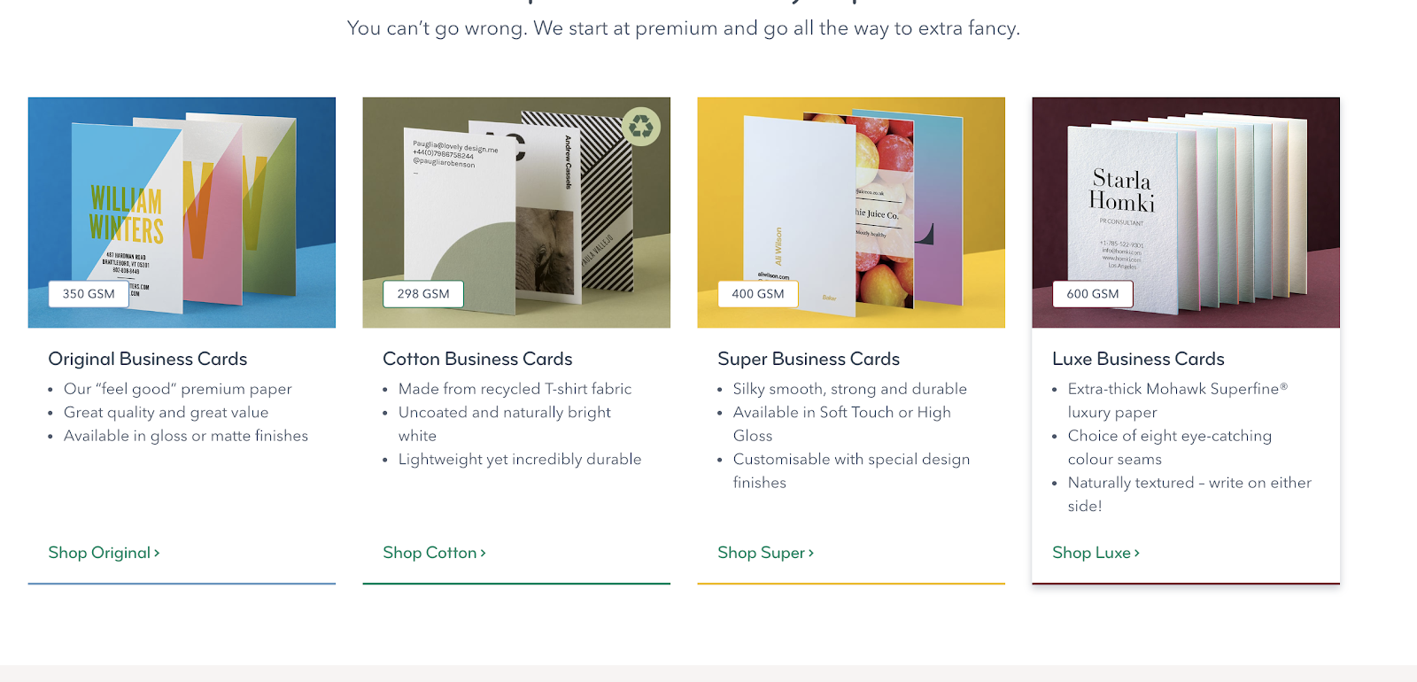
A range of websites were sourced in order to decide upon the most effective. Although some websites were cheaper, moo was selected as a result of a wider range of finishes.

A sample pack of business cards was collated from Moo, allowing myself to gain first-hand knowledge as to how the final outcomes may look. Comments surrounding this process have been made below.
- Gloss allows for a durable, waterproof design
- spot varnish is effective, although means that the cards cannot later be recycled.
- Curved edges appear friendly and stand out from ordinary square designs
As a result of this exercise it was decided that the business card would contain curved edges, and be printed in gloss, ensuring its durability.
Business cards
This blog post outlines considerations made towards my business cards, outlining my creative pattern and production considerations.

Initial drawings were formulated, highlighting key ways in which the business cards may be formulated. In order to ensure the concept is expressed clearly, it was decided that the reverse may contain different careers paths, showcasing my versatility.

From the sketches, a broad range of mock ups were developed. These explore my typesetting skills alongside other design considerations.

- yellow was implemented in order to comply to contemporary design trends, as well as a pre-existing knowledge of colour theory

- the logo has been clearly established, showcasing continuity within the branding

- back variations explore different job roles, showcasing versatility and allowing the product to be specific to roles applied for.


- the four different reverses
- information changes showcasing versatility


Larger variations were explored, although peer feedback suggested that this appeared unprofessional.

A range of hues were explored in order to develop a colour palette in which situates itself with my personality. The business card was centralised, ensuring that the consumer can easily discover the relevant information.

The final business cards present an effective, professional outlook, showcasing my versatility as a designer.
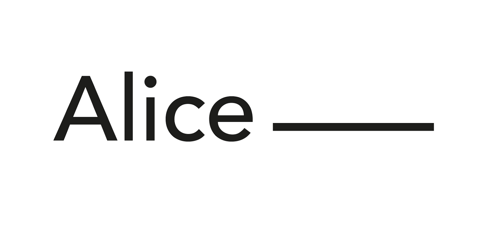
Logo variations
In compliance with previous feedback, logo variations explore both my first and second name. This ensuring that the logo can be used in both formal and informal circumstances.


In conjunction to the now established logo design, it may be implemented within social platforms, and psychical branding attributes.

In conjunction to the now established logo design, it may be implemented within social platforms, and psychical branding attributes.
CAD Variations
This blog case highlights key CAD developments, with feedback offering strong opinions.
__________________________________________________________________________

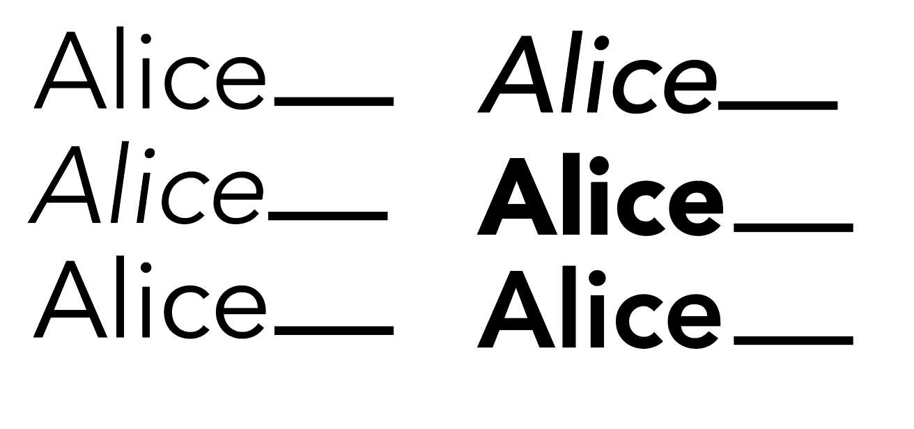
Initial CAD variations explored hand rendered typography. Although this shows character it does not emphasise my design style and thus it was decided that a pre-established typeface would be selected.
Visual concepts focused upon accompanying lines which will explore my job role, asterics in which may be linked to key information and the underlining of my name to embed importance.

A range of typefaces were explored in order to gain an understanding as to which visually represent myself the most. Key information surrounding this has been listed below.
- serif typefaces appear formal and do not provide a contemporary edge
- art deco themed typefaces have no relation to my practice and therefore should not be implemented.
- sans serifs are effective and relate to modern design trends
- as san serifs are frequently embedded within my work, this may be an effective type format in which to use


In conjunction to the initial type variations, some key examples were devised of type in situ. At this stage it was decided that no established type variations had been explored, and that the outcomes were weak because of this. As a result, further type experiments were made.

The idea of implementing colours within dots was explored, although this felt somewhat immature.

Drawing from previous ideas, visual concepts were developed. The most effective designs encapsulate a blank space, leaving room for that of my future job role. It was decided that the selected typeface does not showcase a visually pleasing design and thus further developments will be made.

A range of san serif typefaces were explored. From this task it was decided that Avenir would be selected due to its sleek, contemporary nature.
A range of weights were outlined, with medium being selected. This ensures that the logo will stand out, yet not feel overpowering.
Peers suggested that kerning may be implemented, in order to ensure the final logo variation showcased key typesetting characteristics, further embedding my skills.

Kerning was explored, as well as type alterations, including x-height. This developing a bespoke typeface, individually characterised to resemble oneself.
Subscribe to:
Comments (Atom)