This blog case highlights key CAD developments, with feedback offering strong opinions.
__________________________________________________________________________

Initial CAD variations explored hand rendered typography. Although this shows character it does not emphasise my design style and thus it was decided that a pre-established typeface would be selected.
Visual concepts focused upon accompanying lines which will explore my job role, asterics in which may be linked to key information and the underlining of my name to embed importance.

A range of typefaces were explored in order to gain an understanding as to which visually represent myself the most. Key information surrounding this has been listed below.
- serif typefaces appear formal and do not provide a contemporary edge
- art deco themed typefaces have no relation to my practice and therefore should not be implemented.
- sans serifs are effective and relate to modern design trends
- as san serifs are frequently embedded within my work, this may be an effective type format in which to use


In conjunction to the initial type variations, some key examples were devised of type in situ. At this stage it was decided that no established type variations had been explored, and that the outcomes were weak because of this. As a result, further type experiments were made.

The idea of implementing colours within dots was explored, although this felt somewhat immature.

Drawing from previous ideas, visual concepts were developed. The most effective designs encapsulate a blank space, leaving room for that of my future job role. It was decided that the selected typeface does not showcase a visually pleasing design and thus further developments will be made.

A range of san serif typefaces were explored. From this task it was decided that Avenir would be selected due to its sleek, contemporary nature.
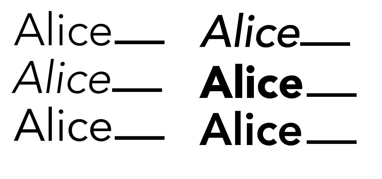
A range of weights were outlined, with medium being selected. This ensures that the logo will stand out, yet not feel overpowering.
Peers suggested that kerning may be implemented, in order to ensure the final logo variation showcased key typesetting characteristics, further embedding my skills.

Kerning was explored, as well as type alterations, including x-height. This developing a bespoke typeface, individually characterised to resemble oneself.
No comments:
Post a Comment