1. Multiple brand color schemes
Traditionally, companies have a few colors that they use across all of their branding and design work. This helps people recognize them out in the world, on social media and other places online.
But I think this design “tradition” is going to be completely upended as brands look for more ways to stand out in 2018 and beyond.
In fact, companies rebranding with a plethora of colors schemes is one of the first trends that I see really taking off.
Spotify started doing this a few years ago in all facets of their design but they were one of only a few.

Now they have such a strong visual brand that I know something came from Spotify almost instantly.
Dropbox also decided to completely ditch their old color palette in 2017 to help update their brand and reach.
Usually, a rebranding effort updates the font or graphic of a company logo, but this one was completely different.

Instead of changing their logo, which everyone already knew, they added a ton of new official brand colors to use with it.
They built this new branding to show that great things can happen when diverse minds work together. And I hate to say it because some people were not big fans, but I kinda love the rebrand.
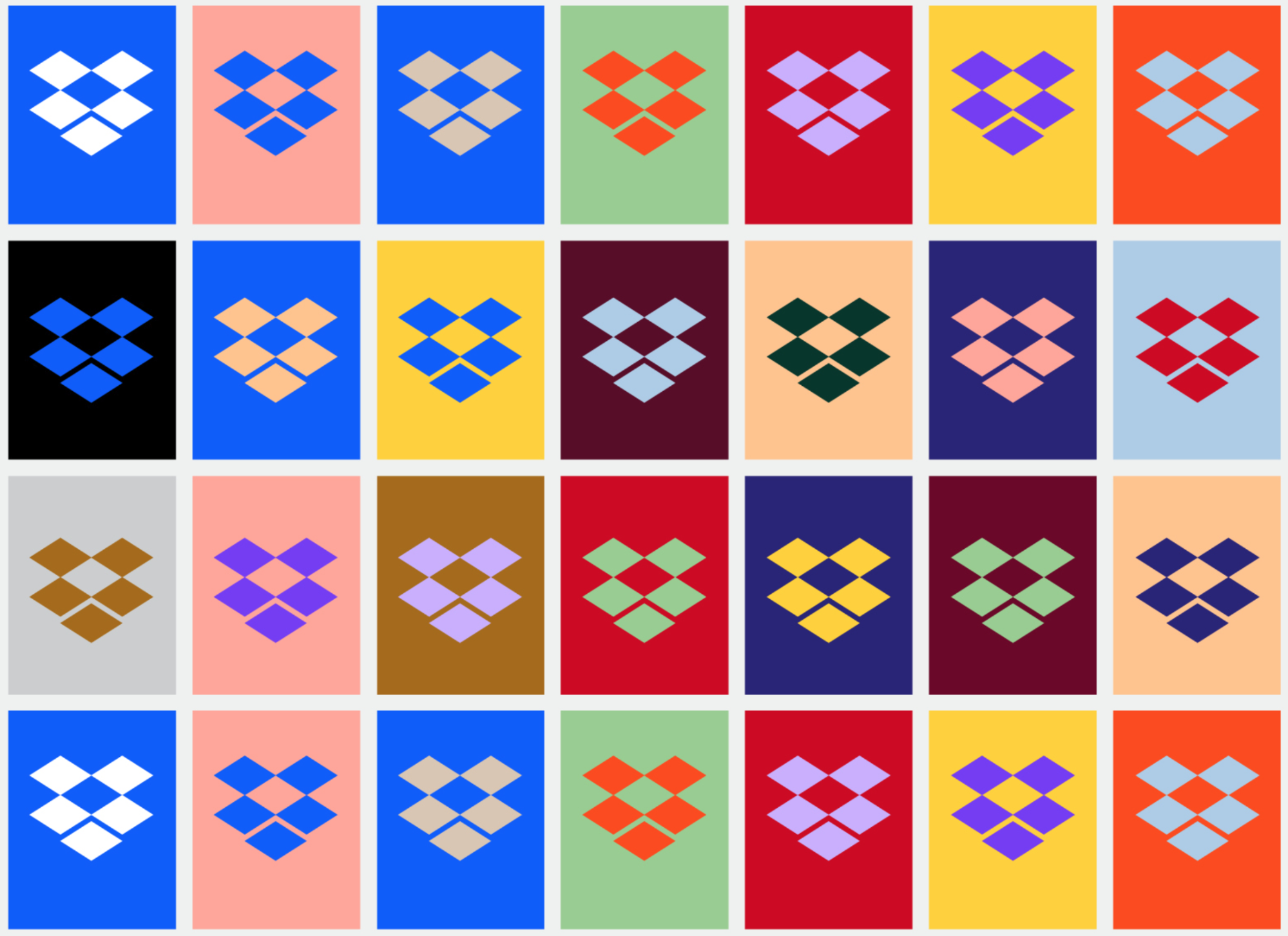
I also think that this change really reflects their growth as a company from a free place to store your school paper, to something that connects the creatives of the world.
Just take a look at how they evolved their social media presence from last year:
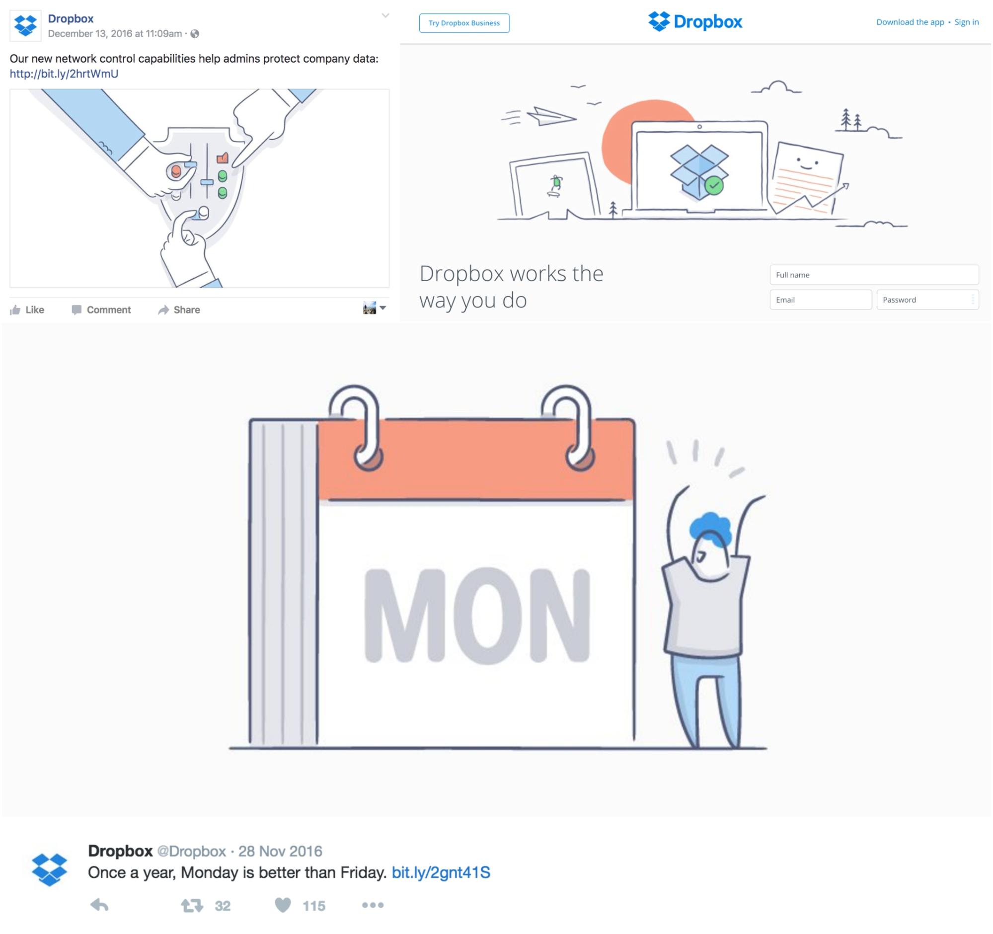
It’s almost like night and day. Who would have thought that breaking design conventions would have allowed for so much creative freedom?
However, I do think that this kind of rebrand can only work with a company that is as big and recognizable as Dropbox.
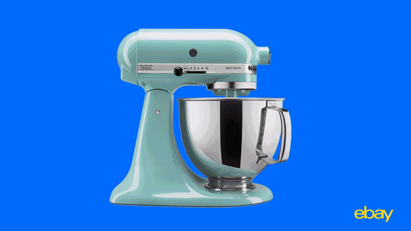
Or eBay, which actually rebranded a few months before Dropbox. In their rebrand, eBay also decided to add a ton of new colors, while keeping their recognizable logo:
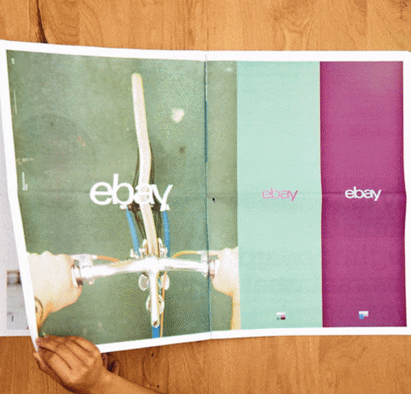
If we want to compare the two rebrands, I think that eBay would win. That isn’t because I was not impressed by Dropbox’s efforts, I just think that it fits eBay’s core business and products better.
Plus, they are using the rebrand across all parts of their platform.
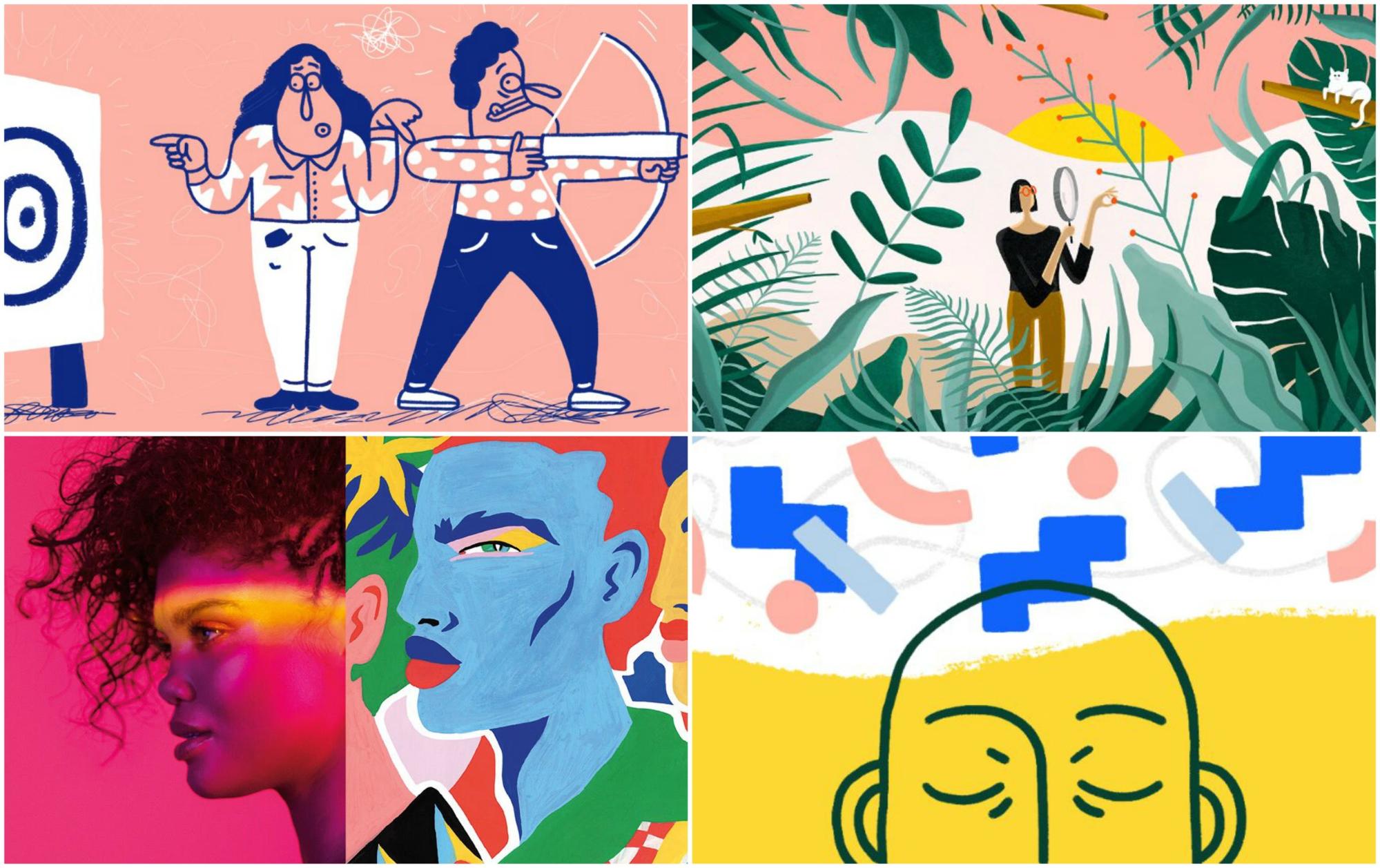
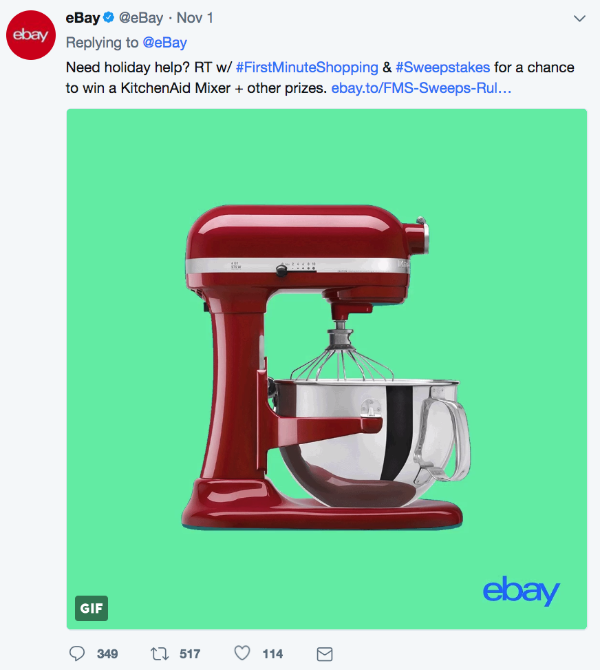
The designers at eBay have used the color upgrade to unify millions of products across their site. Take a look at the examples below:
They may not all share the same colors, but they have the same feel. Even though it’s a mix of pastels and bold colors, the site still looks incredibly clean.
Additionally, they have found a way to inject color into a place that is usually boring and bland: the background.

2. Color gradients
As kids, we thought this was the best way to make your report on dinosaurs look professional. And I think that we were on to something back then.
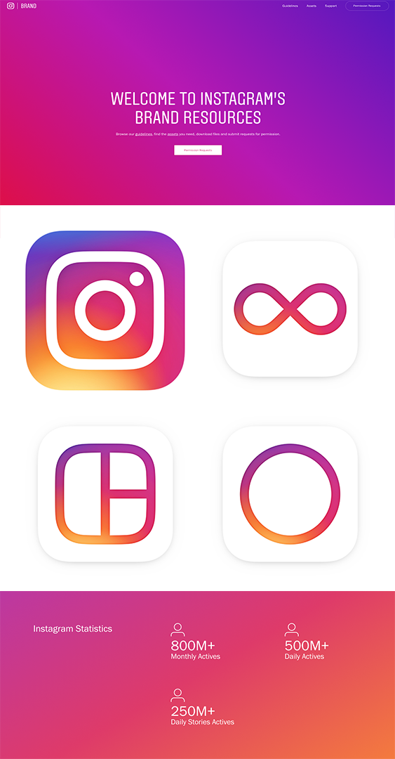
Because in 2018 color gradients will be literally everywhere, from websites to Twitter headers, and even presentations. Instagram, always ahead of the curve, has used it in their branding and logos for the past few years, actually:
Now the rest of the world is starting to catch up.
One of the best examples I have seen of gradients being used comes from Mixpanel, an analytics company. As you can see below, they have adopted a gradient as the main background of their site:
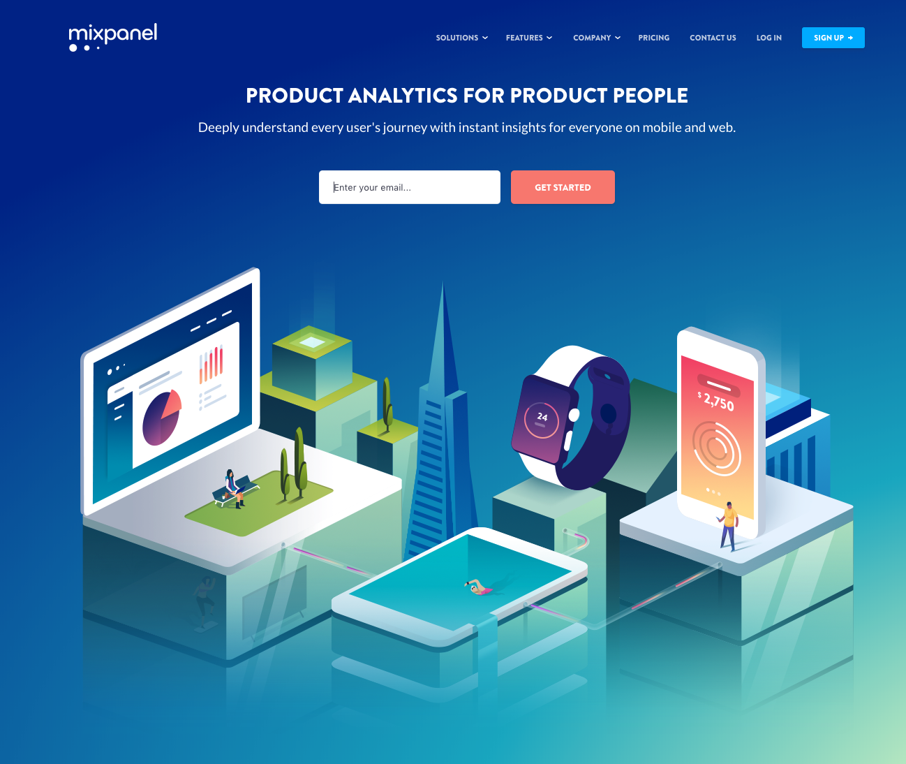
This is a common way for sites to keep a simple background, and add a few flourishes. Otherwise, you’re stuck with a pretty boring single-colored background.
What I haven’t seen much of is gradients being used in every piece of visual content, like Mixpanel did:
This wholehearted adoption of color gradients gives the company a lot of creative freedom, without straying too far from their brand. Because in this case, multiple color gradients is their branding.
The graphs and charts are by far my favorite use of color gradients. It adds that little something extra and helps them stand out from the noise.
A few other large tech brands are bringing gradients back into their designs. Like Stripe:


3. Unconventional colors everywhere
As we have seen so far, 2018 is the year of taking risks in your design.
One of the best places to start taking risks is in the colors that you use.
That doesn’t mean that you need completely rethink your brand’s color palettes, like some of the brands I’ve mentioned already. Instead, be ready to inject some more risky colors in your design projects this year.
Bold colors are the most common driving force that we have seen behind each of the design trends this year. I wouldn’t call any of the following colors traditional in any sense of the word:
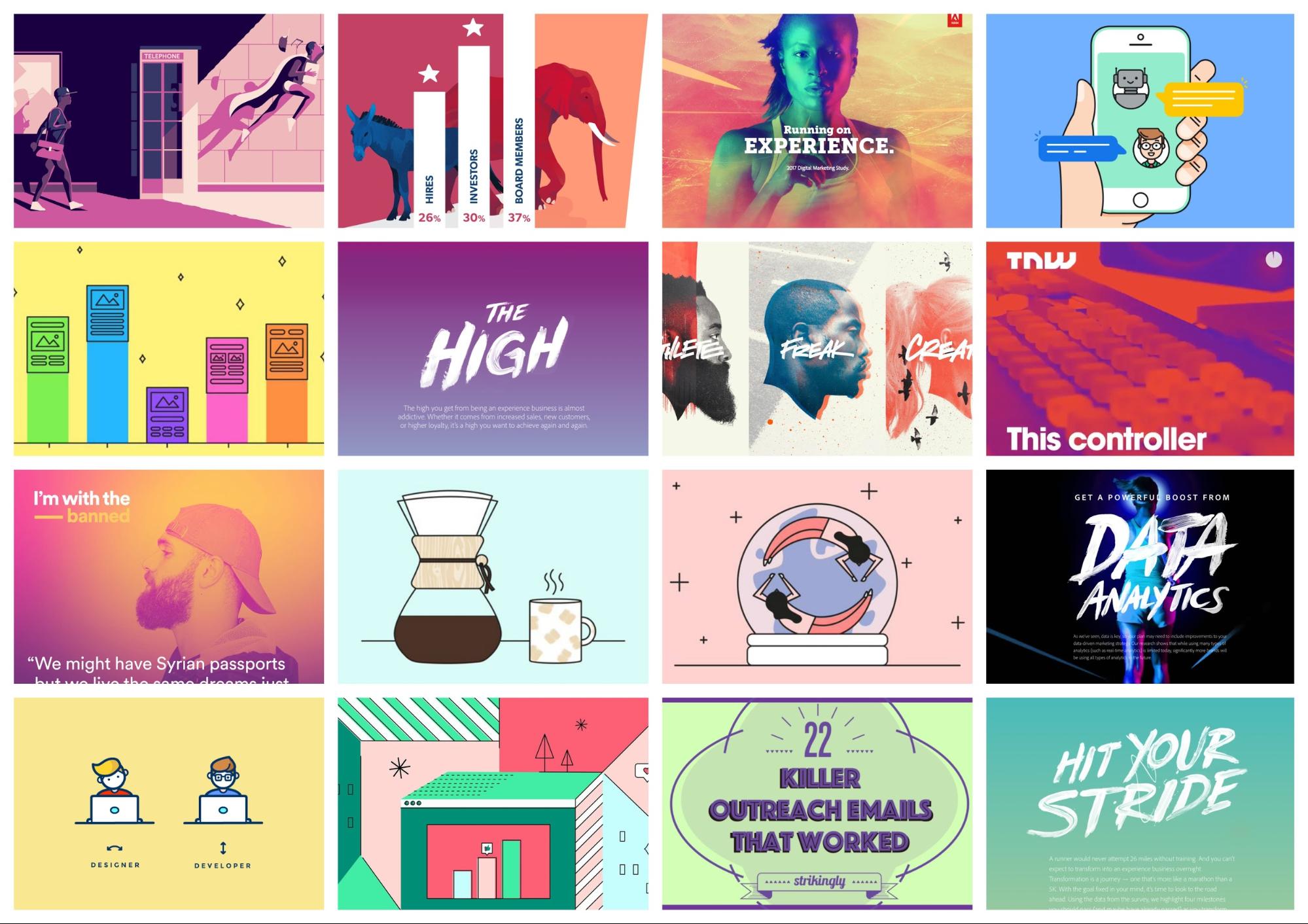
Sticking to the traditional corporate blue palette isn’t going to cut it this year. Also, if you noticed, minimalism and neutral color schemes are on its way out.
Instead, I recommend going a little off the rails with the colors you pick–within reason.
Find a few colors that you can call your “unofficial brand colors” and use them across all your projects. This way, you can do something new and exciting but still stay close to your core values in other places.
A great example of using bold color comes from the sports world, in Bleacher Report. They are in an extremely competitive space, fighting with thousands of sports writers for your eyeballs.
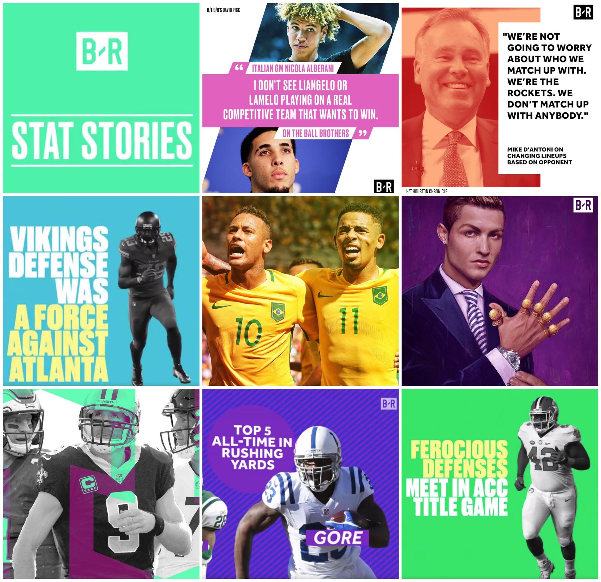
But they consistently use bold, bright colors in their designs to differentiate their content from those others. Because they do it so well, you can quickly spot a Bleacher Report article or Tweet out in the world.
Another example is Fast Company, who have taken to using more non-traditional colors in their magazine covers to entice readers.
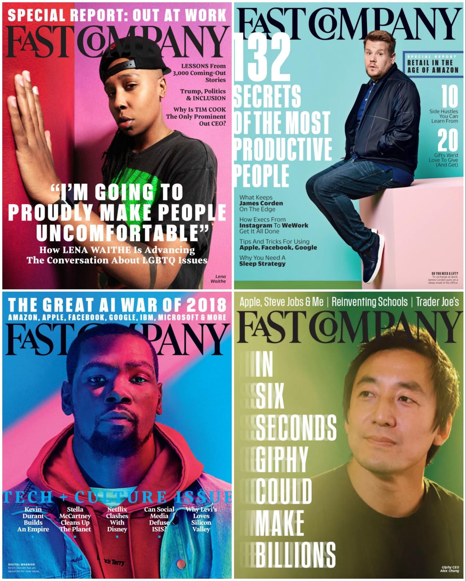
Like Bleacher Report, they’re also using bright and bold colors to stand out in a very competitive space: print journalism. With each issue, they are fighting with thousands of competitors to get the attention readers. And that isn’t an easy task.
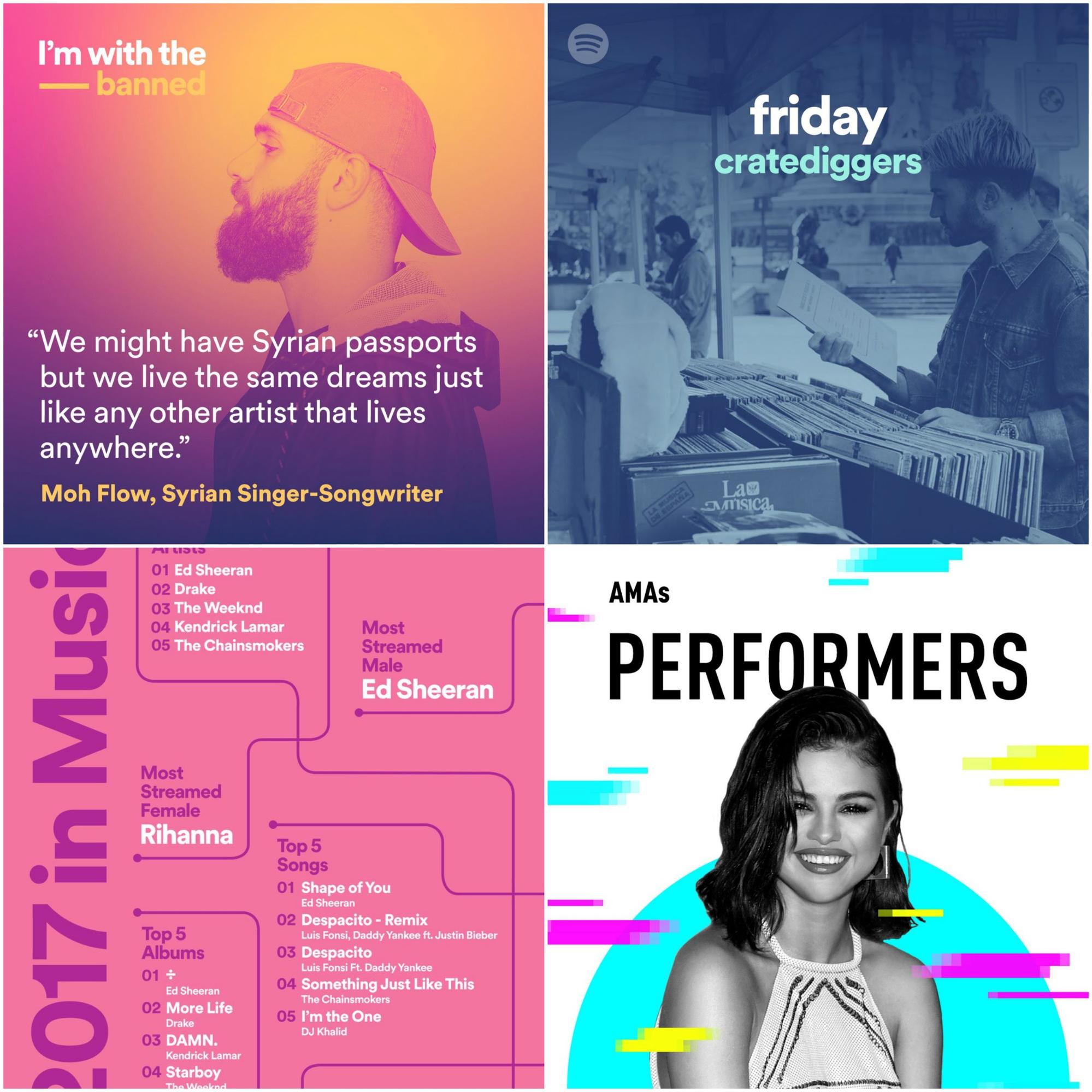
Even online they’re using color to add something extra to their design work.

With the simple addition an interesting color–or five–they made each graphic much more captivating.
Now, I hate to bring Spotify up again, but they have effectively been disrupting the space for the past few years. You can definitely see this in their color usage lately as well:
I have talked a few times before about being to spot something from Spotify just from their non traditional color usage. Especially in their most recent Wrapped experience, which shows your listening habits for the past year: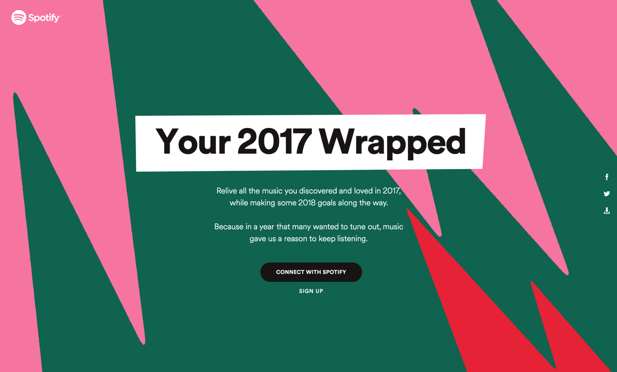
For a few weeks after they launched this promotion, I was even able to spot other people’s lists, just based on the colors they used.
If that isn’t an effective use of color, I don’t know what is.
4. Bold & handwritten fonts dominate
Another way to add some eye-catching features to your designs is to use some bold or handwritten fonts. This is another trend that seems to come from the design world, moving away from boring minimalism as a whole.
Bold and handwritten fonts are going to stand out against the simple or overused fonts that your competitors are using. And they will help your content jump off the screen on social media–whether it’s infographics for your blog, Facebook ads, or motivational quotes on your social media.
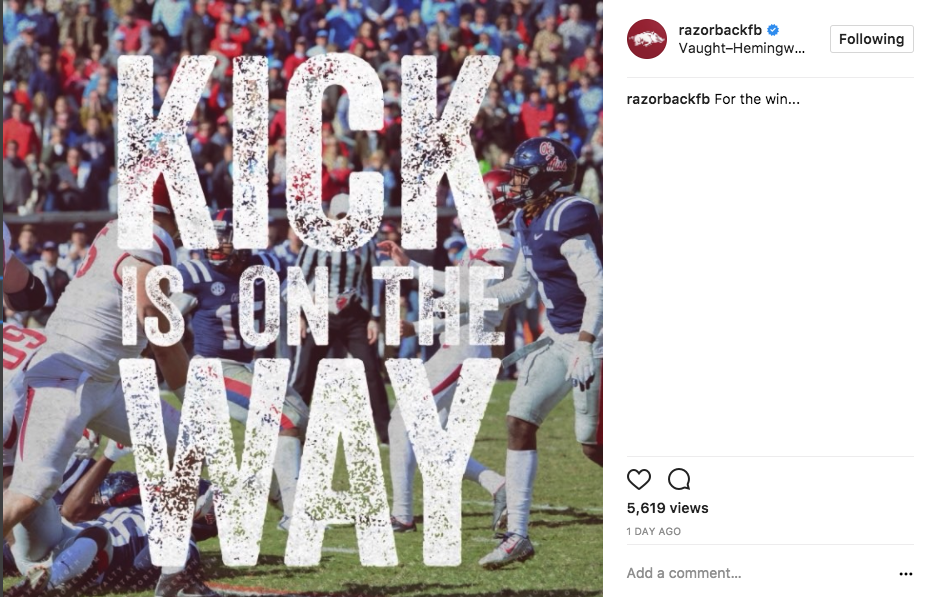
Kinda like my alma mater, the University of Arkansas, does below:
But neither feels out of the ordinary for a brand like Adidas. Everything they create and share feels natural because they have created such a strong visual brand over the past few years.
I believe that this adoption of ultra bold and handwritten fonts coincided with their plan to become a more fashion-forward brand. That choice has helped really sell the mystique of these new type of shoes they are creating.
Another incredible example of using both bold and handwritten fonts together comes from Adobe:
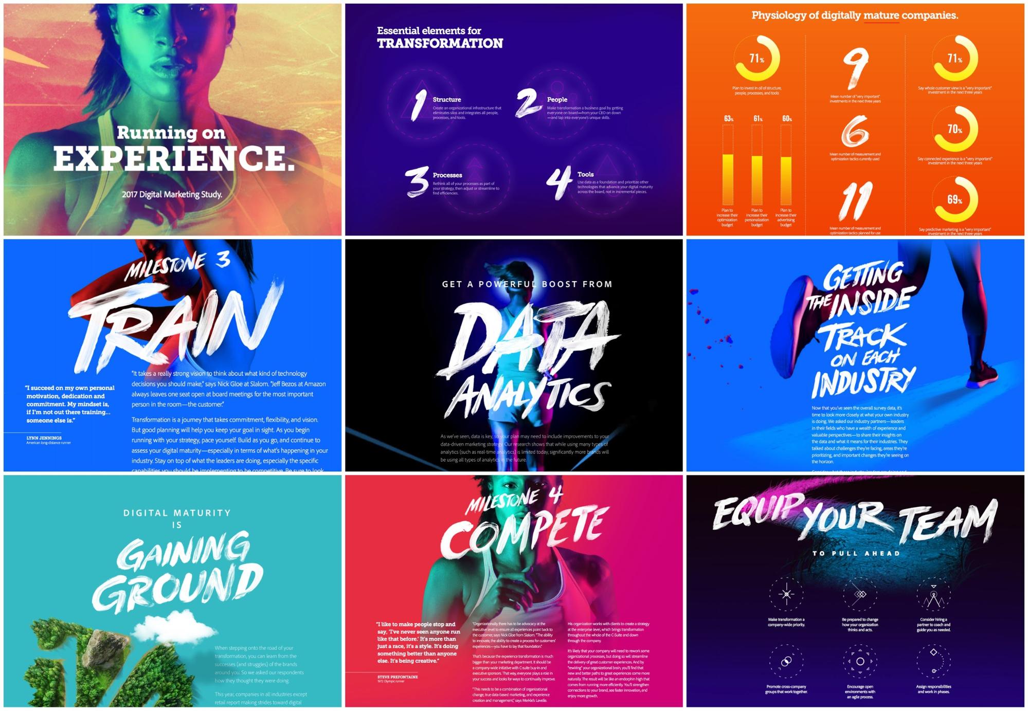
With this Digital Marketing Report, they are able to seamlessly blend together both bold and handwritten fonts, in addition to using some awesome gradients, GIFs and unique colors.
In fact, Adobe seems to be embodying all of the trends I’ve mentioned so far. If the leader in design is using them, I think they’re a safe bet.
Thoughts......
- Handwritten overlay type is impactful-draws attention from millennials
- multiple colour logo variations
- add multiple colour scheme for a brand
- colour gradients are highly effective-more impactful than one singular colour
- unconventional colours are highly impactful, especially in circumstances in which you would not expect them to be
No comments:
Post a Comment