Thursday, 17 March 2016
Self Evaluation
As I have expreimented extensively with screen print within this project this is definitely a realm in which I would like to follow further, especially with that of traditional print. My time management within this project is an issue in which I would like to tackle within the future, as I feel the overall design process was rushed. I will also aim to include my ethics within future projects.
Wednesday, 16 March 2016

Tuesday, 15 March 2016
Final Crit


When discussing my work with peers the 3 colour approach was highly applauded, suggesting that the relationship to the pantone colours of the year was a strong concept in which will constantly evolve my branding. It was also suggested that the relationship with colour allows the company the opportunity to choose, a factor in which they will personally like, as it suggests that the design conclusion is in their hands. The importance of business cards was also discussed suggesting that they are universal, and should thus work effectively.

The headers were discussed and it was stated that they were very formal and a design aspect in which is not usually involved with designers. Due to this in the future I am not likely to consider using these, although if I find an innovative way in which to express the header I may consider a differing approach.


When discussing the cv it was stated that I should express the style in which I work further with either a written commentary or imagery. It was also suggested that I could involve some form of mini portfolio to send out with my CV's. I felt that this would be an effective method of getting myself noticed as a designer and thus would definetly consider this as a plan of action for the future.


The relationship of my work and ethics was discussed, with praise being given to the aesthetic as it was suggested that ethics was applied to the physical identity of the branding and not just the book. As the lines within the illustration are dense it was suggested to use Helvetic Bold in order to somewhat balance the design. The reverse of the design was analysed suggesting that the screenprinting of the information and logo would be much more effective.


social media-Instagram


To decide upon the general style of my Instagram I looked at other creativites, in order to give myself an idea surrounding what factors build a good Instagram. I found that white backgrounds were highly sort after as they didn't distract from the work. I also found that a mixture of photography and graphical worked appeared well, especially when creates blogged about exhibits in which they visited.

As I strongly believe in ethics my first ideas involved spray painting animals. Both a lion and cheetah in order to embed my passion for animals and their rights. Using the animals as characters they were placed next to my work.
When taking this idea to the critique it was suggested that the animals had to real relevance to my work as I had not previously involved them within any design aspects. The silver aspect of the animals was also questioned. Due to this I decided to take a completely different approach.


In order to have a more informed Instagram I decided to develop contact pages at the end of each project correlating all the imagery in which I felt strong. From this I then decided upon the strongest imagery to put upon my Instagram.


To keep consistency within my images I decided to download Whiteagram, an app in which gives your images a white background. I felt that this helped with the overall clarity of my Instagram. I exhibited a variation of images including others work, screen prints, monoprints, photography and books I found interesting.

In order to express my concepts I developed informed descriptions focusing on the brief and my own personal opinions about my design work.

In order for my work to be explored by other designers I decided to use hashtags, this in turn allowing myself to get noticed by design companies.
When taking my Instagram to the final critique it was suggested that this approach was much more effective than that of the first as it appeared more informed. It was also suggested that the icon should be my logo, I considered doing this during the design process but decided upon a picture of myself in order to develop a personal response, and due to this will not be altering the design. Hashtags were suggested in order to get my work further explored by designers. Overall the response was positive, with some comments suggesting to show more experimental work, this is definitely something in which I will explore.
Social media-snapchat
In order to conduct opinions and primary research I decided upon developing a snapchat. I felt that this would also allow me to share my day in day out art process, following projects as they go on.
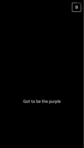
After developing my snapchat I decided to ask for opinions surrounding my business cards and what colour worked most effectively. From this i gained a range of response, some are depicted below.


From conducting this research I found that purple was the favoured colour with 8 votes, green second with 6 and pink last with 5. When developing the colours of my business card in the future to match trending pantones, I must conduct research like this to ensure that one colour isn't extremely disliked.
Overall I felt that snapchat is an effective way in which to promote and most importantly as a student gain feedback upon my work, and what to alter.
When taking this idea to the crit, it was highly responded to as others suggested that it was a unique way in which to target a younger creative demographic. They also stated that even if the snapchat didn't gain multiple followers it was a good way in which to gain criticism.
Evaluation

Header
My reason behind developing a header was that when developing notes I could write them upon the header in order to spread my brand, the headers would then appear upon my blog, instagram, snapchat and twitter, thus embedding my logo subconsciously amongst other designers. I also felt that headers would allow me to appear as a professional rather than purely a student.
The headers were produced in both pink and white, an informal and formal approach. I decided to do this to display myself as a playful creative but also a future business woman.
The structure of the header is basic, clear and legible. All components in which is expected from a header. The relevant information is present, and the typeface is legible and thus I am unable to fault the structure of this design. The general aesthetic could appear more interesting, but the design completes its purpose.

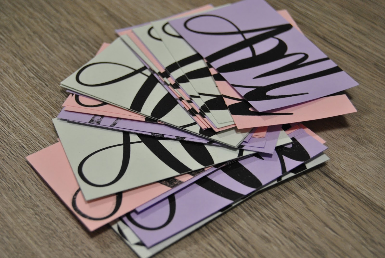
The three colour approach to that of my business cards is probably the design aspect in which I feel strongest, as it allows multiple associations to be made towards the design. The screenprinting process to develop these designs took a considerable amount of time, a factor I must consider due to the availabilty to print. Also some of the cards appeared to be slightly of centre due to the general arrangement. If I were to complete further screen prints of these designs I must develop a concept in which allows me to print the designs appropriately upon each side.
Another limitation is that the colours of the card are not exactly that of pantone, although when buying stock I attempted to get the closest colour match.

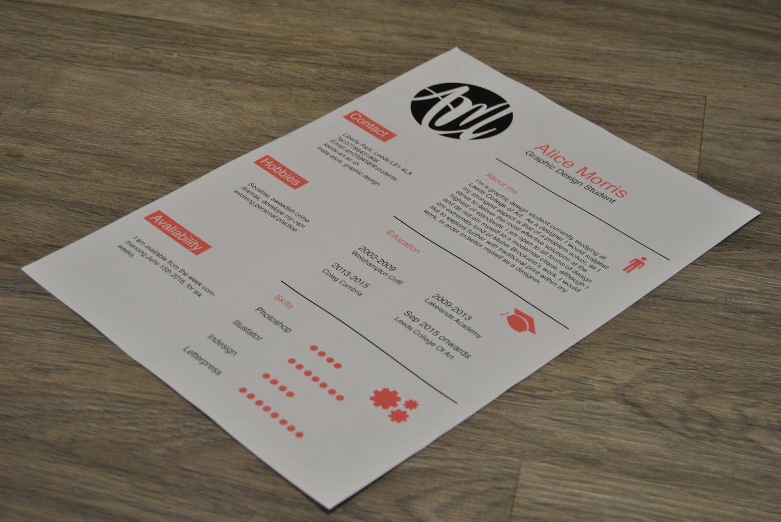
Cv
The general layout of the cv is affective due to precision in which the general information is presented. The colour scheme complies to that of the project, although the tone differs slightly due to the CMKY printing, a factor in which I may consider further before distrubuting the designs. The structure is the most relivent component within the design, as information such as the hobbies may be altered to suit myself at the time of distubution. Overall, I believe that this is an effective approach towards cv design.

Again the notebook was made in order to exhibit my brand image. When applying for design companies I will send them my notebooks, thus every time they see the book they will instantly think of my brand. As the likely hood of this notebook is that it will be stored away until its needed, the designers may forget my name, and thus it may be a good idea to include my name and contact details on the reverse. I feel that the screen printed nature of the book gives it an extra edge over that of a digitally printed book. The logo is slightly ajar causing the design to appear somewhat unprofessional, the amount of pages within the design should also be increased in order to mimic that of a real book. I could have also experimented with lined paper rather than blank in order to express a 'jotter' appeal.


I feel as if developing a code of ethics really embeds a personal approach towards my self branding project, as it is a design aspect in which is unique to myself. The content itself is clear and legible, although somewhat dull. Although it is a formal document the front cover involves an illustration and thus maybe this is an approach I could follow within the 3 spread layout.
In order to make the general aesthetic more interesting I added a light aspect to the door in which embedded the idea of being insightful. I did this by hand, using a white ink pen. I really liked the effect in which this created, as it gave the design a personal approach-a factor in which I attempted to explore with further on the reverse of the design.
The general style in which is possesed within this book is one that I like, although I feel that elements in which I completed after screenprinting work less effectively. During the critique it was suggested that I add my logo to the design in order to create continuity with the others, and thus I stuck my logo on the reverse something in which I now feel looks very amateur. It was also suggested that I write my name and contact details handwritten on the back, I also believe this is a design in which I regret, due to its informal nature. The card use was also too thick and thus when folded creases occurred, so stock would be another factor in which to consider when mass printing the designs.
Subscribe to:
Comments (Atom)