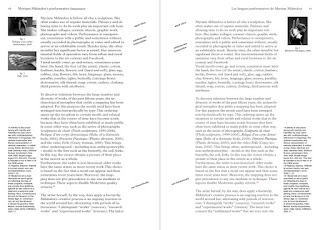
Although the books content is extremely important I mustn't overload each page with type as the book would then become a daunting task in which each company should read. The design should be minimal, with reference to vignelli's code as each line should not contain more than 12 words. This will inturn lead to a design in which is not over complicated, and difficult to read.
I began to think about formal ways in which the text could be presented within a double page spread. I explored a range of approaches in which included that of flush left and right, although I felt that following Vignelli's canon would be the most effective approach and thus decided that flush left would be the best to develop a readable piece. I then explored further with negative space and how this may effect the information represented. During the following stages I will explore with the type using C.A.D.
Following my sketches I explored a range of layouts in order to promote legibility. As the design is also a code I focused upon making the design appear strong, as if to be 'set in stone'. The designs in which I felt reflected this best were that that involved compact blocks of text.
In order for my work to appear as a professional document I eliminated any hyfans/orphans, in turn developing a book in which is strong in design.
Overall, I feel that the general style of the content effectively exhbits the infromation. The design is easy to naviagte and doesn't appear to be daughting. The text is applied across a three page spread to allow for negative space to be applied, making the design appear aesthetically pleasing. Following my design relivence the chosen typeface was that of Helvetica. I did not feel the need to alter the typeface within this design as I believe its simplistic nature does not distract from the true meaning of the content.


No comments:
Post a Comment