When reflecting upon this module it has become evident that I have engaged with out of university activities much more than in first year, with exhibitions and professional talks influencing modules and my overarching practice.
In terms of skill set I have learnt an array of binding methods, as well learning how to develop both hard and soft covers for books. I have also participated within workshops learning how to complete the process of foiling, embossing and debossing. All skill sets in which I believe will influence my practice within level 6.
Over the past year I would suggest that I have grown as a designer, am able to make more effective criticisms and have developed my own aesthetic. Developing my own style has been a key outcome of this year as within my first year I was very undirected.
In terms of grades, as of far, I believe I have tried my best for every module, pushing myself further and thus I believe this will be reflected in my grade.
Monday, 8 May 2017
Other module evaluations
C.O.P
Overall, I believe that I have fully engaged with COP. Multiple attempts have been made in order to better my essay, with Simon supporting this, and influencing the ways in which the essay should be formatted. I have attempted to make strong links between my essay and practical work, as this is the criteria in which my COP lacked in level 4.
The essay itself highlights the lack of women within design and the reasonings behind this. The practical work has taken key statistics surrounding young female designers, and attempted to develop a platform in which female creatives work may be exhibited, in turn promoting female design to creative directors.
A collective was developed, through young female designers at LCA, with the idea that future designs may be used to promote this.
The publication was developed in order to express this directly to creative directors, as research found they are far more inclined to explore physical work than digital. The logo for the collective in which was expressed on the front cover was said to have been somewhat offensive to male designers. As a result of this, the logo will be changed before a 'real' publication is developed by the collective.
When trying to promote the collective's work within the design, it was discovered that many members didn't want to submit as they had not finalised pieces etc, and as a result other female creatives were used. Although their permission was asked, no response was gained and thus this could not be developed commercially.
In order to gain feedback from the design, I sent the publication to rabbit hole, a male based deisgn studio in leeds. So far no response has been made.
When thinking about the key challenges of the project, I personally found it difficult to explore with colour. As it was discovered that some think pink is a feminist colour and others do not. I decided myself that it was not offense, as feedback was gained from peers, as well as online.
Mock ups were developed in order to promote the best design possible, with this aiding with the overall design process.
YCN Evaluation-UK greetings
When thinking about the overall project it is evident that there are both strong and weak areas. One of the initial struggles with this brief was that it was very open, and I personally found it difficult to develop a range in which was contextual. As a result of this I explored with my own personal ethics, of design being accessible by all.
When developing the culturally appropriate range, it was evident that vast amounts of research had to be conducted into non offense deisgn. This research was then embedded within the design in order to format a relevant, suitable design. This research could have been explored further with focus groups being developed whereby an array of people from different cultures joined together and assessed my work.
The cards were initially formatted as these are the most accessible part of the collection in terms of pricing. As there had to be four cards developed this also meant that different designs should be placed. The card designs themselves were bright, colourful and impactful. The illustrative style also directly targets women. Some design iconography was said to not be appropriate for all cultures (for example alcohol) as a result of this, these designs were removed.
Following the same illustrative style the rest of the set was developed. A colour pallete was developed throughout in order to ensure that of the designs appeared cohesive.
The notebook designs were developed in conjunction to this, although I felt that the busy pattern in which they express does not comply to this. Large white backgrounds are also expressed through the illustrations, a factor in which has not been mimicked within the rest of the set.
The notecard collection is fun and innovative, although I am unsure whether the outer packaging and the product link. As the cards themselves maintain a 'university', educational feel, I believe that the streamer effect upon the envelope is not representative as this suggests some form of a celebration. I also believe that the design could have been pushed further with envelopes being developed in order to contain each notecard.
The gift bag design is sturdy and practical, although handles could be added in order to promote a more user friendly design.
When overviewing the products as a whole I would suggest that the collection is powerful, and maintains a strong concept. I would also suggest that the physical building of the products will allow my designs to stand out to the YCN judges.
504
From completing this module key learning outcomes have been achieved. My knowledge upon the production with design has previously been very limited and thus multiple aspects of this module have given me a greater insight into how the industry works.
Generally speaking, the book developed expressed stronger imagery, text and production than that of the book developed last year in which was simply bound by a ring binder. My knowledge upon binding methods, materials and stock has also increased. A greater knowledge has also been gained upon mass book production, as I was previously unaware of how to develop a cost effective book. Many struggles were contained throughout the project, mostly being that of the production, and thus areas of development have been highlighted within this briefs evaluation.
When completing brief 2 new challenges occurred, as I had not previously done design for screen. Vast research had to be conducted to allow a greater knowledge upon design 'rules' this in turn allowing myself to increase my design knowledge. Although I did not enjoy this brief as much as the previous, I felt it highly relevant as being a designer within the 21st century means that ever increasing technologies will need an interface.
From this module, it is evident that design for screen and print widely differs although the same design ethos is made, some of the key features are listed below:
- How design engages the user's senses. Obviously with print multiple senses may be tackled such as sight, touch, and smell. To embed these feelings into screen design vibrations are often made, allowing the consumer to engage further with the product.
- Usability & Navigation. With print navigation often means simply turning from page to page and is therefore not usually considered as much as it is in within design for screen. In screen design multiple tests must be carried out in order to ensure that the designs are easy to navigate.
- RGB/CMYK
- Cost.The cost of developing apps are often highly different to that of the price of print.
- Shelf life-how long the product is used for.
Plans for the future
In order to ensure I am moving forward as a designer throughout the rest of my degree i have set myself some aims for summer and that of level 6, these can be seen below.
- Explore further with the female collective
- Gain a placement
- Go to at least 3 studio visits
- Set myself two of my own briefs over summer
- Develop an online portfolio
- Use LinkedIn more proficiently
- Re-brand myself if applicable
When thinking about other future plans, I must save at least £500 throughout the year in order to pay for a months rent when I leave university. I believe this is essential as I must not return home as I believe that the job opportunities there are very limited.
Job search
As I was unsure upon job availability I decided to look into jobs currently going for postgrades within Leeds and Manchester. I believe it is important to stay up north as I have previously read an article stating that 'theres is no good design up north as everyone leaves for London', as a result of this I would like to stay up north and help the ever changing northern creative industries.


From looking online I was able to gather that there are numerous jobs within the north, although I believe that Indeed is an insufficient website as the jobs gain mass applications and do not promote an portfolio etc. As a result of this I will ask john what platforms he believes to be best.


From looking online I was able to gather that there are numerous jobs within the north, although I believe that Indeed is an insufficient website as the jobs gain mass applications and do not promote an portfolio etc. As a result of this I will ask john what platforms he believes to be best.
Sunday, 7 May 2017
2nd year compared to 1st
When thinking about the differences between first and second year I believe that my design has altered massively.
Concept
Within the first year of the programme I often focused upon the aesthetic of the design rather than the concept behind it. I have attempted to challenge this within my second year and base all my design of concept/ theory.
Theory
Theories have been implemented within my second year design in order to promote strong informed design. Although theorists such as Gestalt were highlighted in first year I felt that implementing further theorists has prompted form and legibility.
Research
Compared to last year I would suggest that more primary research has been conducted, in turn promoting a more conceptual response.
Final outcomes
Final outcomes within second year have been professionally photographed, in turn promoting myself as a designer who is professional/trustworthy.
I also believe that this year I have been more engaged with the deisgn and have attempted to create strong design for my own portfolio rather than to simply pass the degree.
Bookbinding


As 504 was a large 30 credit module, extensive research and practice was undergone into binding methods. I found that test variations had to be firstly made in order to promote a clean natured bind.
Binding methods learnt include: saddle stitch, coptic binding, perfect bind and concertina. From completing these binding method tutorials I now believe to be confident in knowledge upon the different binds, as well as understanding their strengths and weaknesses. Some key information in which I remeber surrounding these methods has been listed below.
Saddle stitch- very simple, can only do up to 24 pages. Often does not let to book close flat when mass pages are used.
Coptic bind-Allows the book to lie flat, strong binding method
Perfect bind- Professional, over time pages fall out
As a result of understanding these binding methods I will, in the future, be able to decide what binding method is most suitable for a project. An examples of this are listed below.
A company would like a 10 page booklet printing surrounding pricing for their products, they have a low budget. -In solution to this a saddle stitch approach would be derived as it is cheap, effective and easy to open.
A company would like a large catalogue developing of their products-In solution to this a coptic bind would be used, alongside segments in order to promote a strong design in which lays flat.
How primary and secondary research can effect a design
This year I have uncovered how important primary research is to constructing a design as it allows for a real life influence towards the design.
A key example of this is that I have interviewed individuals who were willing to discuss the effects that heart diseases has had on their lives for 505. I believe that gaining such information has allowed myself to develop a design in which would personally connect to them, the target audience. These individuals were also asked for feedback upon my final product whereby I could get an actual insight into how effective the product is for the problem.
Primary research has also been highly relevant throughout other briefs with exhibitions frequently giving design inspiration for set briefs. An example of this is how the play it loud exhibition aided my 505 studio brief one poster.
By gaining inspirations for exhibitions/books this allows myself an advantage as I am opening myself to more design then that is available online and pinterest. Although when completing digital based research I have now found myself looking on behance for inspiration as this platform is filled with a vast range of strong, innovative design.
Surveys have also been a key influence in my design this year, as I did not complete these within my first year of my degree. They allow for a greater insight and statistical view of questions, in turn promoting a more accurate design.
When thinking about other ways to complete primary research a list has been developed for that of methods in which I wish to explore within third year, this can be seen below.
- Observational (looking how others interact with design)
- Test marketing
- focus groups
- interview
I believe that exploring with these research skills will allow myself a stronger body of resarch for future projects.
Responsive influence on my design practice
Responsive as a module has allowed myself to publically have my work judged. It has also allowed myself to work on live briefs and to strict deadlines. This forcing myself to focus largely on time management as mass briefs were due over the course of a week. The selected briefs were chosen in order to develop design in which I had not previous. These briefs and the influence they have had on my design have been outlined below.
In cold blood penguin book cover-
This book cover design explored a scalpel approach in which I had not previously undertaken. This therefore allowing myself to explore with an array of design. By completing a book cover I was able to gain a portfolio piece in which I believe that many design companies may be interested in.
To kill a mockingbird penguin book cover
As penguin offer a thousand pound price for the winner of each book category, I believe that this design competition is ethical and hence why I participated within it. I also believed that developing a book cover would allow myself to be part of a cult design trend in which surrounds instagrams designers, in turn gaining attention.
UK Greeting
UK greetings was selected as my large brief as I had not previously completed a design of this calobra. I also had no previous knowledge upon repeated patterns and nets and therefore felt this brief would allow me to explore with these.
Although I enjoyed doing the brief and it allowed me to explore with illustration, I would suggest that it was very difficult to develop a concept for a design in which was so open.
Companies
As last year I developed a list of companies in which I believe to be unethical and therefore would not work for, I decided to update this list in relation to scandals etc in which I believe have affected my willingness to work for such companies. Although I know that I should not be picky when it comes to gaining work, I also believe that it is highly important to have your own ethical guide as a designer and thus I believe this to be relevant. The 'blacklist' is as follows.
- Nike
- Adidas
- Coca-cola
- Mcdonalds
- Primark
- Toyota
- Shell
- Nestle
- MAC
- Amazon
- Seaworld
- Oracle
- Wal-mart
I will also not work for any companies that are involved in:
-Animal testing on beauty products (as I don't use products in which test on animals I feel that it would be unethical of myself to be graphically involved with such companies).
-Exploitation of workers (although I enjoy packaging design and am likely to follow it within my future career, I will not be working for any companies in which exploit humans for their own gain).
-Harmful attitude towards animals (If you wouldn't do it to a human, you shouldn't do it to an animal).
When firstly joining the course-5 things I wanted to improve
As I wanted to track my own progress I decided to re-read my blogs from the first week of level 4. From this an activity was developed in which highlights my key aims for the course. These are listed below.
- My drawings skills.
- The concepts behind my designs.
- The platforms I design upon, for example to use screen printing.
- The way I think about art. I want to submerge myself in design, rather than just choosing to do it as a career.
- My knowledge of art movements.
As I had officially completed my aims for Level 5, it became evident that I most definitely had already completed my initial aims for the degree.
My drawing skills have been widely explored with first year secret 7, Uk greetings and Penguin books all focusing upon illustration. I have also completed vast drawings for each brief in order to visually record my ideas.
Conceptual design has now become a key part of who I am as a designer. Colour, typography, layout and materials are now all influenced by the concept or that of theories, a factor in which was not relevant during my A Levels.
Before coming to university I had not explored with any design other than screen and thus the course has already been a large eye opener for myself learning: screenprint, monoprint, foiling, embossing, debossing, and binding.
My knowledge of art movements has also dramatically increased. As a result of COP I have a greater understanding upon how women have been treated throughout design/art history, I have gathered knowledge upon street art movements, modernism, postmodernism, globalization through design, Art nouveau, parody and pastiche, and consumerism.
As a result of this I believe that new aims for the rest of the course should be outlined.
Gathering Feedback
As Level 5 is far more self directed I have found myself asking peers if they would like to have feedback sessions rather than waiting for sessions to be put in place. I believe this has allowed myself to gain feedback at relevant stages during the design period rather than 'wasting' feedback sessions.
In order to gain a wider range of feedback I have also found myself gaining feedback from other courses. As I am friends with numerous illustration students I have found it influential gaining design feedback from a different angle.
In terms of professional feedback, I have emailed designers when it appears relevant. Very few designers have gotten back to me when doing this, which is understandable as they do not know myself.
I have also asked other graphic design students for feedback in which study at differing universities. As we have all been taught different elements of design I believe this has aided myself greatly, with some of my friends from salford discussing in depth colour theory with myself.

Only studio
Only is an award-winning strategy and design consultancy helping organisations to use design to innovate and grow. Focusing mainly on design interface the work from only is highly prominent with the current market, leading the studio to work alongside high profile clients.
From the talk with Only studios multiple areas of user interface were discussed, this aiding with the 504 module. Key notes were taken from this in order to gather a greater understanding upon digital design in turn influencing the module.
- It was stated that you do not need to code in order to develop a user interface, and that the company themselves often use another body in order to develop their work visually. I felt this to be highly insightful and I was unsure upon how I may be expected to complete this within my future career.
They also suggested that the design process should be as follows.
Research
How the audience interact with the internet.
Any competitors
And the tone of voice.
And the tone of voice.
Wire framing
Ideas
Key interactions-tests?
Mock ups of each page
Think about scale
Design
Develop 'physical wireframes'-bring these to life.
Front end
Guidelines-typography/grids (for the client)
Patterns (to create endless pages)
Online guidelines-info not lost
BIMA-largest digital netwo
As a result of this I was able to follow these design stages throughout the module and gain a large understanding upon where I needed to be within the design stage. I also felt that this aided my deisgn greatly and allowed myself to get as good of a mark as I did.
As a result of this I was able to follow these design stages throughout the module and gain a large understanding upon where I needed to be within the design stage. I also felt that this aided my deisgn greatly and allowed myself to get as good of a mark as I did.
Reflecting on my Aims for level 5
When firstly starting level 5 I gave myself some aims in which I wished to follow throughout the year. As I am now coming to the end of level 5 I feel as if this would be a good time to reflect on this. These are listed below.
-Explore social media further. I would like to explore my online presence further in order to get my work out there for other designers to notice.
-Collaboration. I would like to push myself to work with others on small projects outside university.
-Processes. I shall explore with multiple processes in order to ensure my work is not just digital. I would also like to explore processes in which I have not previously tried.
-Books. Over the past year I feel as if I haven't read as many book as I would like, and thus next year I will read more books, surrounding both design and art.
-Finally I would like to come out of the year with a solid 2:1, and to have hopefully got a 1st within certain modules.
In reference to the first aim, I do believe that my social media presence has increased with myself gaining over 70 likes on specific design related instagram photos. I have also uploaded multiple projects to behance and developed a Linkedin. In order to push this further I would like to add work experience to my LinkedIn and thus this may be a focus over summer/level 6.


The second aim was collaboration. Throughout this year I have collaborated as part of responsive, but I have also worked alongside Tess, attempting to digitally brand her. As a result of this I believe that I have been involved with collaborations this year although further collabs may be made with the collectives over that of the summer months.
The third aim was exploring processes. This year I have gained a large knowledge upon digital processes learning about coding and how a website is constructed. I have also learnt further into CMYK and RGB. In non digital terms I have again explored with screenprint and monoprint in an attempt to perfect these methods. I have also explored with embossing/debossing and foiling, design processes in which I have previously not completed. As university is open for a couple of weeks after we finish I would like to have another go at foiling as I believe this to be an area in which I struggled with. In binding terms I have learnt multiple new methods and discovered sections. This also went onto teach me how to paginate a book as this is an area in which I struggled. Applying bookrum and bookcloth was also another non digital method in which I learnt this year, a factor in which future employees will hopefully be encouraged by.
Reading was mentioned within my aims as I personally felt that in first year I did not read very much. This year I have read as of current: Vignelli's cannon, Intern magazine, know your onions and how to be a graphic designer without losing your soul. I believe these books to have influenced my design massively with Vignelli's rules being specifically implemented within my design.
My final aim was to come out of the year with a 2:1. As my first module received 68, fingers crossed that my other modules will remain in the bracket.
Living with Creatives
As of second year I have been directly living with individuals who are Level 5 graphic design students. Although sometimes it can feel as if we live and die for design I do believe that this has benefited my practice greatly. I am able to openly discuss briefs with my peers at anytime as well as gaining feedback. One issue that arose from this was that I was only gaining feedback from the same people and thus I have attempted to branch out over the year visiting crit box, as well as asking other course members for feedback.
By surrounding myself with design oriented individuals I also have people who are interested within the same things as myself to go to exhibitions and workshops with. I believe this to have enhanced my practice as I have been able to gather inspiration from a large range of primary resources compared to that of previous.
As we are living together next year we have discussed having an 'open house' and displaying an exhibition in a real life manner. This may be interesting and definitely something in which we explore with further.
How collab has effected me
One of the main issues faced with my collaboration was that I was friends with the individuals in which I collaborated with. Although I did attempt to find others I felt that courses didn't overly engage with one another. As a result of this I did end up collaborating with individuals in which I previously know.
From this I felt as if some individuals felt it offensive when I was attempting to make constructive criticism and took it personally. I did not intent to do this, and I believe being friends made this situation worse.
I also usually take charge and manage projects, but I did make specific effort not to control the group as I wanted us to be engaged with one another. This benefited the group and therefore I will attempt to do this in future projects as I do feel that I can sometimes be bossy.
Another area I found interesting during this project was time management, as I discovered that mine was relatively strong compared to that of others. This was difficult with certain aspects of the project as I was relying on others to complete work before I could continue. As a result of this if I were to complete further collaborations I will ensure, and push for others to complete work on schedule.
As an extra I got into contact with that of a product designer for this project. I felt that this allowed myself to gather knowledge upon how products are officially designed, as well as gaining a greater understanding upon materials.
What have I learnt from each interview
Tim's interview
From conducting the interview with Tim I believe that my confidence in the creative fields largely rose. I felt as if I was able to personally talk to a creative without feeling nervous, and was able to confidently discuss design.
One of the key factors in which I gained from the interview with Tim was that user interface design is largely growing and thus it would be naive to not explore with this format of design. He also suggested that this is a proficient way in which to gain money once leaving university and setting up your own business. So these must be factors I consider, and explore with during level 6.
I also discovered from Tim that it is good to know the rules to break the rules. As this is an area in which he has further learnt since finishing his degree.
Jane Bowyer interview
From gaining a response from Jane, I was able to gain a female's perspective of industry. When discussing the industry and the different cost of projects she suggested that although some smaller projects may be more relevant to her design style, she often finds herself going for higher payed projects in order to 'eat'. As a result of this I should ensure that I am not too picky when selecting projects in the future.
When discussing work up north she suggested that the creative industry in Manchester is very lively, relating the quote "Manchester's got everything except a beach”. As a result of this I must consider Manchester as a future workplace, if I wish to stay up north.
I found Jane's interview highly inspiring, especially when she discussing being a woman in a workplace. I felt that the following extract really spoke to myself, allowing for Jane's personal insight to be heard.
'Do I feel my journey would have been easier if I were a male? Yes. But isn’t that true of most areas of our lives? We live in a world where patriarchy is not only deeply ingrained in cultures around the world but it's written into the law as a means of controlling the actions of women so when you’ve got all that going on it’s difficult to imagine a scenario where’d it be easier to be a woman than a man.
On a personal level, in my career I have encountered sexism but I’ve also had some excellent male mentors and colleagues who have championed me. I think there is still a ‘boys club’ mentality in some agencies that excludes women — its not always with conscious intention more a passive, unawareness of what discrimination might be taking place and how to do something about it.'
Eve Warren interview
When discussing women's role within the workplace, I found the following quote by eve inspiring. 'I completely understand that as a women it can be a really daunting experience to walk into a studio full of men for an interview but in my experience all studios I've interacted with have all been keen to close their gender gap.' As a female designer I felt that this quote allowed me a great knowledge into the industry and in turn made myself not daughted of all male deisgn studios. It has also made me open to applying to an all male design studio.
As I am personally unsure upon how I plan on staying up north once I finish my degree, I felt that eves interview really helped me understand how I could do this. She also suggested staying up north would allow me to do this far easier than if I were to move to London.
Design trends of 2017
Environmental design
Environmental and social impact
Making products uses resources, including the materials used in the product and the energy needed to make it. Using these resources has an impact on the environment and society.
The designer of electronic products should consider a number of factors in order to reduce environmental impact, including:
the material used to make the product
the life of the product
disposal: what happens to the product at the end of its life?
Materials
Reducing the use of materials
While the choice of electrical components is decided by what the circuit needs to do, the designer can choose the materials for the enclosure.
One way to reduce impact on the environment is to use less material in the enclosure. This might mean asking questions about what materials are needed or whether the enclosure could be made smaller (or thinner) and still do the same job. It could also mean using an alternative material with better properties, so that not as much of the material is required.
Using renewable resources

Some materials have less impact on the environment than others. A renewable resource is one which can be replaced naturally in a relatively short time. Wood from managed softwood forests is renewable, because these trees can be regrown in a few years.
In comparison, most plastics are made from oil. Oil is a non-renewable resource, meaning that there is only a certain amount of oil available and as it is used it cannot be replaced. Using non-renewable resources means that they will eventually run out.
By-products

Most manufacturing processes produce various kinds of waste as a by-product. Sometimes these by-products contain toxic substances harmful to people or the environment.
When choosing the materials to use, the designer should consider how they will be made and any by-products that these processes might produce.
The life of the product

Most products are only expected to last for so long before they stop working, are worn out or are thrown away. How long a product will last is an important design consideration.
The longer the product's life, the fewer new materials will be needed for replacements. However, a longer life also means that the manufacturer will sell fewer replacement products.
The life of a product can be extended by using materials with better properties: eg by using stronger materials or materials that resist corrosion. Another way is through design that allows product life to be extended by maintenance.
Design for maintenance

Maintenance means any activity that allows the product to have a longer life: it can include anything from repairing worn-out parts to replacing batteries.
Designing a product to allow maintenance means including features that allow parts to be easily replaced, such as access panels and standard screws.
Alternatively, the product might be designed to be made from a series of standard modules, meaning that if something went wrong, only the faulty module would have to be repaired or replaced.
- Is the product recyclable?- it should be
- Matt stocks are more frequently used as less ink is needed
- When producing mass scale inks should be considered, vegetable ink are a strong solution.
- Shelf life-make sure if the product is meant to last it will-reducing the amount of times the consumer needs to by the product
- Consider the brands/companies environmental ethos before developing work for them
- Consider the carbon footprint of each product made
- Any poor design decisions in which result in pollution are my own fault, I am responsive for my own environmental design
PPP Presentation notes
2nd slide
- interest in sculpture design
- an non obvious form of inspiration
- Hepworth inspired future colour palettes etc
3rd slide
- Play it loud gig poster exhibition
- assisted with 505
- opened myself up to different ways to screen print
- colour became a key influence
4th slide
- Level 6 illustration exhibition-supporting members from LCA
- Discussions with illustrators about potential colabs
- Inspired myself to explore with illustration
5th slide
- 170 years of LCA
- discussion with Tess
- how the process didn't work out from what I initially thought
- how this aided me-contracts etc
6th slide
- Engagement with other creatives
- interview with Tim
- discussion with alumni
7th slide
- Skills: contextual designer, manipulate my own style for different briefs, team player, often a leader.
- Focuses: colour, user interface, book design (Tim Dee suggested that you need to include user interface as it is the future of design)
8th slide
- Favourite module of the year
- mass skills learnt surrounding production
- wireframes are essential, new knowledge about coders etc
9th slide
- Group work
- difficult as I was friends with them
10th slide
- Getting my work out there
- hashtags are essential to get my workout to a greater audience
- behance-simple, easy, used by professionals
11th slide
- My own USP
- knowledge upon random topic areas
- confidence
12th slide
- self branding is still applicable, still an environmental designer
13th slide
- The future
- Dissertation research over summer
- Searching for a placement for level 6
- Work with headhunter
- further work for the two collectives
Female collective
As part of COP I developed that of a female collective as I personally believe it is essential that female designers are brought into light, as it is evident that the creative industries are still lead by males.
As a result of this a collective was derived of strong female designers. As a response to this (for my COP) I developed that of a collective logo, publication and website. These being essential matters in order to get female design out there. The idea of the collective was to not disinclude males, but to rather create a balance within the creative industries.


It was decided that the female design catalogue would be sent to that of male based design studios in order to promote female designers, with the website acting as a second portal. One of the key pieces of feedback gained surrounding this project was that the logo appeared to exclude men, a factor in which does not promote feminism. As a result of this, this will be altered over summer.
When discussing the collective further with the members it has been decided that we are largely going to focus upon this over the summer months. The following ideas have been suggested:
As a result of this a collective was derived of strong female designers. As a response to this (for my COP) I developed that of a collective logo, publication and website. These being essential matters in order to get female design out there. The idea of the collective was to not disinclude males, but to rather create a balance within the creative industries.


When discussing the collective further with the members it has been decided that we are largely going to focus upon this over the summer months. The following ideas have been suggested:
- exhibitions
- zine
- interviews with all male design studios-ask why?
- A publication focusing upon bias in industry
- A 'conference' surrounding female designers
- Female designer talks
We aim to complete at least one of the above over the summer months.
Life's a pitch ideas


I explored with promoting a range of my pieces although I felt it best to explore with a broad range of design. The final spread highlights this clearly as publication design has been explored alongside poster and user interface design. This is to promote that I am able to work on multiple platforms a factor in which Tim Dee suggested to be key at engaging creative directors etc.
Lifes a pitch-Deciding what to place on the presentation
When thinking about what to say on the presentation, we decided we would list what makes us unique designers. From this the following passage was derived about myself. 'Encouraged by ethical practice and non-limited to any area or style.' This sentence was derived as I personally believe it is highly important to be an ethical designer and consider environmental impact. I also am susceptible to working on multiple platforms, in turn promoting myself as a very open designer.
Collective ideas -Life’s A Pitch .
Life’s A Pitch .
The outlined brief is as follows 'An important part of your professional growth is to develop an ability to work collaboratively and productively with others. Working in small mixed groups drawn from a number of LCA creative degree programme’s you will develop fully and pitch a professional proposal for a public facing venture to best showcase and promote the individual works of the collective . This could take the form of ( but certainly is not limited to) an exhibition, publication or online presence , or perhaps a combination of these. Through research and planning you will explore the basics of how to identify an appropriate venue, audience and market, structure your team to optimize your individual and group skills and knowledge, investigate the legal and financial obligations of developing and launching a creative initiative, seek appropriate professional support & advice, plan and control finances and effectively promote, brand and communicate your presence to external parties and partners.
Your team will pitch a fully developed proposal describing and visualising the showcase with appropriate visual aids.
Your individual presentation should be based on the analysis and content that you have been introduced to throughout the module and your experience of working in a collaborative partnership.'
From the above brief a collective was derived. This focused primarily on graphic design students as we believed that we all have a similar work ethos.
Members: Myself, Jen Lea, Calum Cooke, Dom Cartledge, Hannah Rottger, and Anna Farmer.
When thinking about what we want to do as a collective it was suggested that the aim was to promote one another as well as creating some really visually impactive yet contextual design. As a collective we focus on the different aspects of graphic design and the variety of unique styles that fall within the creative industry, as we all have different goals/talents. As a result of this we decided to name the collective A.W.O.L (All Walks Of Life).
As a collective we developed the following mindmap in which highlights the different ways in which we could promote ourselves as well as one another.

From this we found that social media was a large aspect, as we could cheaply share one another's work and thus this may be an area to focus on. We also decided that a publication may be an effective way in which to get our work out there, especially when thinking about creative agencies and design companies.
As a result of this social media accounts were set up. I was primarily in charge of the instagram whereby a description of the collective was placed, alongside that of others work.
When thinking specifically about the publication, it was decided that a spread each could be developed in order to promote us all equally. These spreads could then maintain our own personal style, allowing ourselves to be fully expressive.
Final designs and evaluation


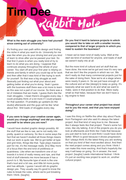
The final design highlights the vibrant trends in which are explored with Tim's design. The typography used mimics the same raw nature in which Tim notes within the interview. The hand rendered nature of this typography also attempts to mimic Tim's work for transform 16, a large scale project in which he recently completed. The pattern used also complies to this. Bold colours have been used throughout in order to express the impact in which is promoted throughout Tim's design. Pink has been used as the main colour due to its relationship with the international film festival and transform 16, again two projects in which Tim has strong connections to.
The reasoning behind the worded front cover relates to a personal joke between myself and Tim, in which run throughout the interview. This has been embeded within the design in order to promote my personality. In turn securing a personal approach towards the design. Although this concept may be apparent some of my peers suggested that this may not be appropriate as it appears somewhat offensive. Although I agree that it could appear somewhat offensive to someone, I believe that Tim will connect it to the personal joke and therefore will not find the design offensive.
Saturday, 6 May 2017
stock considerations and printing
Stock is highly important as even strong design can appear weak if not produced using the correct stock. As the poster is double sided it must be ensured that the paper is not transparent as this will make the design seem immature. The heavier the stock, the more expensive a product feels and thus this must be brought to mind, although as this will be placed upon glass the weight must not be too heavy, as the poster will drop.
The poster was printed upon a 200 gsm matt stock, as matt is currently a large trend I felt this appropriate. Unfortunately, as the double sided printer slots were full, I had to print at drop in meaning only one copy could be developed.
The poster was printed upon a 200 gsm matt stock, as matt is currently a large trend I felt this appropriate. Unfortunately, as the double sided printer slots were full, I had to print at drop in meaning only one copy could be developed.
Pattern variations (reverse)
As the front cover was completed, I then had to think about the reverse in which contained the interview itself. As I previously condensed and formatted the interview, I just had to decide upon what design aesthetic it should maintain.


Following on from the front cover, the pattern was brought through to the reverse. The typography was altered in order to gain a typeface in which expresses the raw nature in which Tim aspires to. Although this approach was strong I felt that the pattern seemed somewhat confined and thus the pattern was explored with over the text.


Although this seemed to mimic Tims loud design much more effective, it became apparent that this caused legibility issues. Opacity was explored with although I felt this did not overly help.
When asking my peers about how they think the reverse should be formatted, one of my peers suggested that I should focus on a two tone approach, promoting a one colour background. This in turn not distracting from the text but mimicking Tim.


Type was explored with, focusing on the bold type in which Tim embeds within his own work.


Various colours were explored with for the background, but it was decided that the two tone approaches were most effective. When deciding upon either the pink or orange background it was decided that either may be used in order to express a variation.
Layout Variations


Multiple design layouts were explored in order to promote legibility. Paragraphing also became a key influence when completing this.

The question titles were made bold in order to promote the different aspects of the interview, this in turn making it easier for Tim to navigate. I also explored with a caption in which I felt suiting to Tim, although I decided that the designated area should maintain his name, as this has not previously been listed.
Front cover variations

As it was suggested that colour should be implemented within the design I decided to explore with ways to do this. The above pink was selected as it has been used within Tims work for the international film festival as well as transform16. I decided to explore with highlighting certain aspects as the previous black and white version made the interview appear boring, something in which it definitely was not. By adding vibrant colours it shows that although a lot of talking was done this was highly interesting.


As transform 16 was a large project for Tim, I attempted to mimic the iconic paint stripes within the design. Although the above attempts were only mock ups, I felt that this could be made far more effective by mimicking the colours present within the original design.

A more regimented approach was explored, although I felt that the square box went against tims design.

Following that of the paint brush effect within transform 16, the above approach was derived. The lively nature of the design promotes the interview as being highly motivational, as well as showing how passionate Tim is about colour.
Subscribe to:
Comments (Atom)