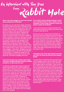
As the front cover was completed, I then had to think about the reverse in which contained the interview itself. As I previously condensed and formatted the interview, I just had to decide upon what design aesthetic it should maintain.
Following on from the front cover, the pattern was brought through to the reverse. The typography was altered in order to gain a typeface in which expresses the raw nature in which Tim aspires to. Although this approach was strong I felt that the pattern seemed somewhat confined and thus the pattern was explored with over the text.
Although this seemed to mimic Tims loud design much more effective, it became apparent that this caused legibility issues. Opacity was explored with although I felt this did not overly help.
When asking my peers about how they think the reverse should be formatted, one of my peers suggested that I should focus on a two tone approach, promoting a one colour background. This in turn not distracting from the text but mimicking Tim.
Type was explored with, focusing on the bold type in which Tim embeds within his own work.
Various colours were explored with for the background, but it was decided that the two tone approaches were most effective. When deciding upon either the pink or orange background it was decided that either may be used in order to express a variation.


No comments:
Post a Comment